Exhibition

Ad Reinhardt: Print—Painting—Maquette
Want to know more?

Past

September 12—October 19, 2024

Opening Reception

Thursday, September 12, 6–8 PM

Location

New York: 20th Street

537 West 20th Street

New York, New York 10011

Curators

Jeffrey Weiss

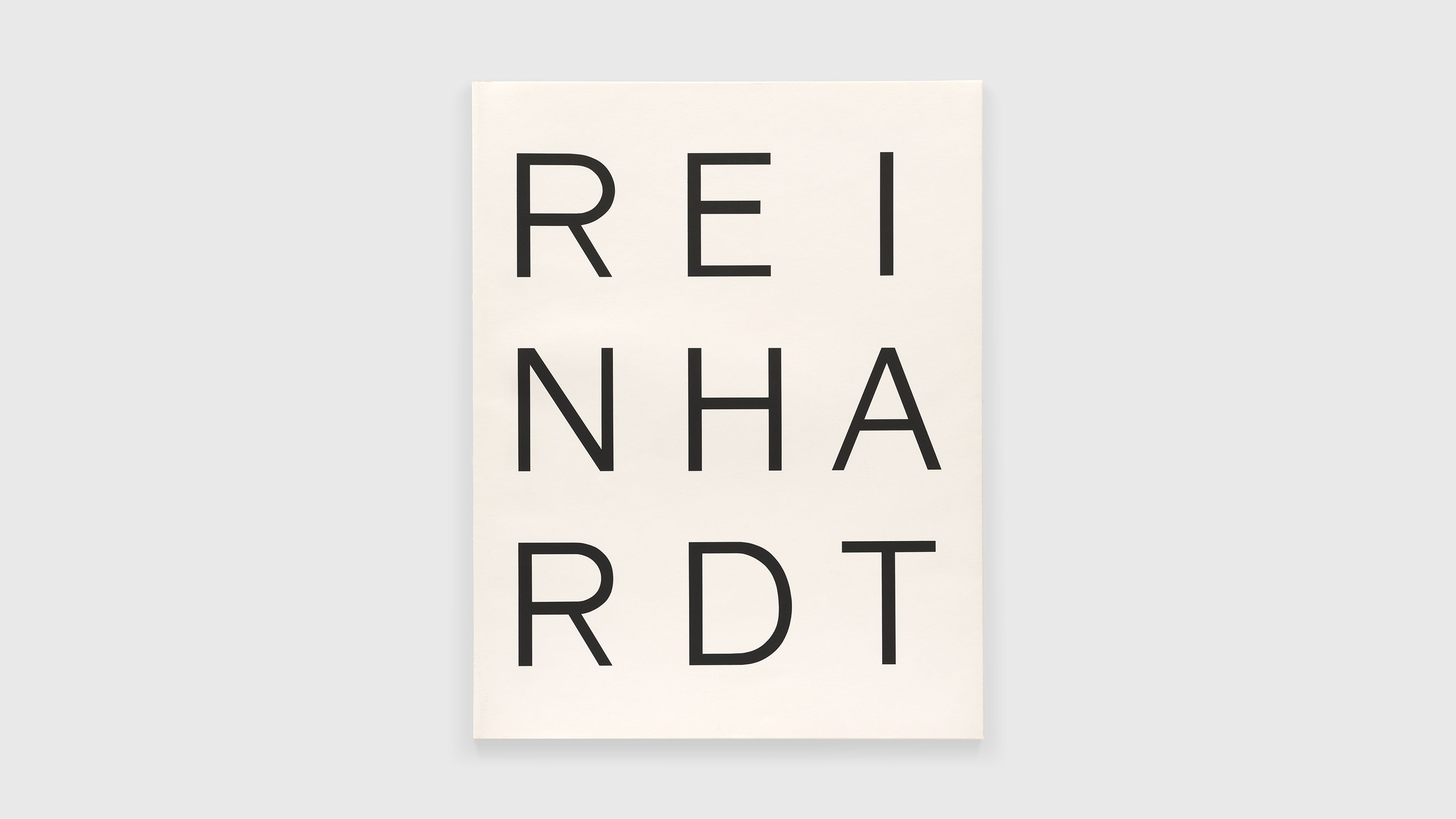
Ad Reinhardt, 10 Screenprints (portfolio cover), 1966.

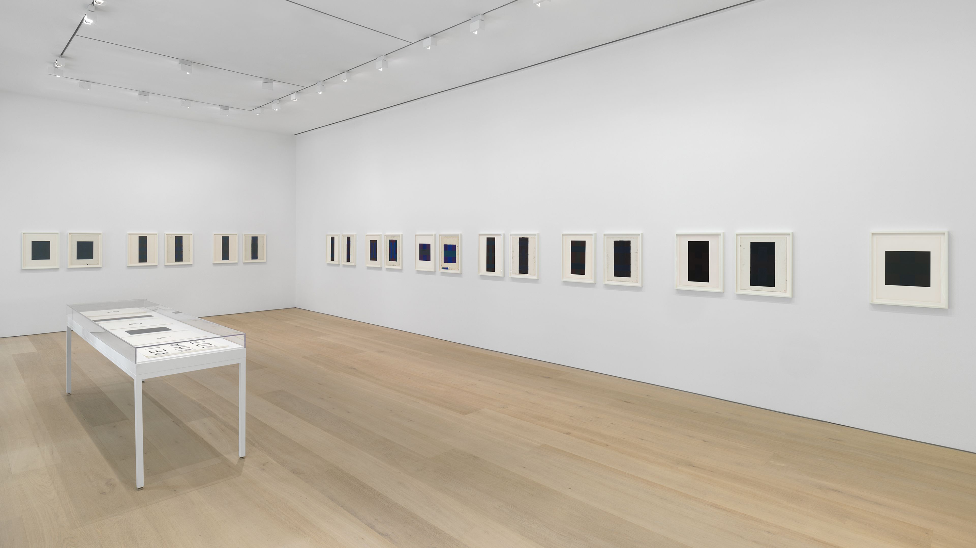
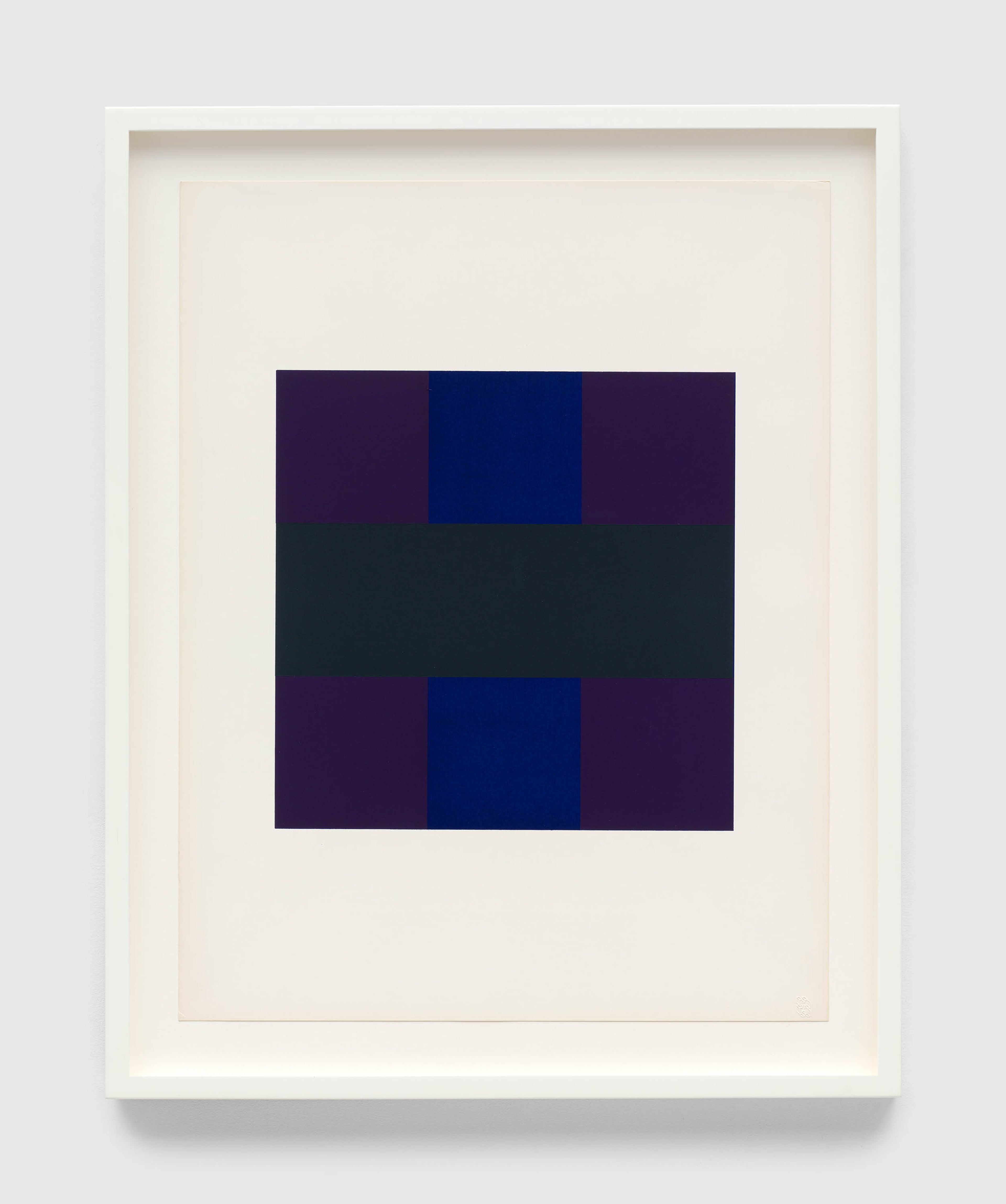
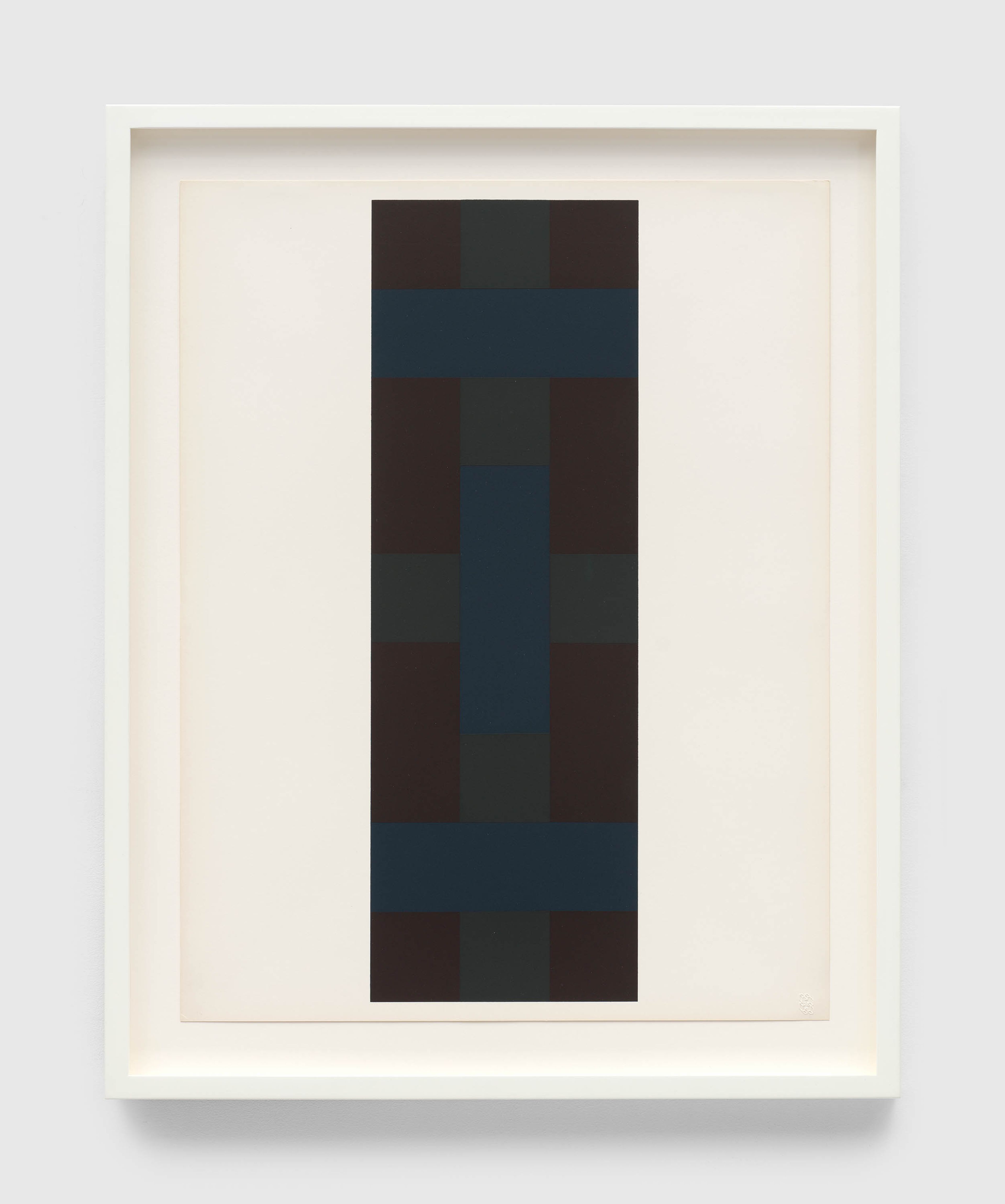
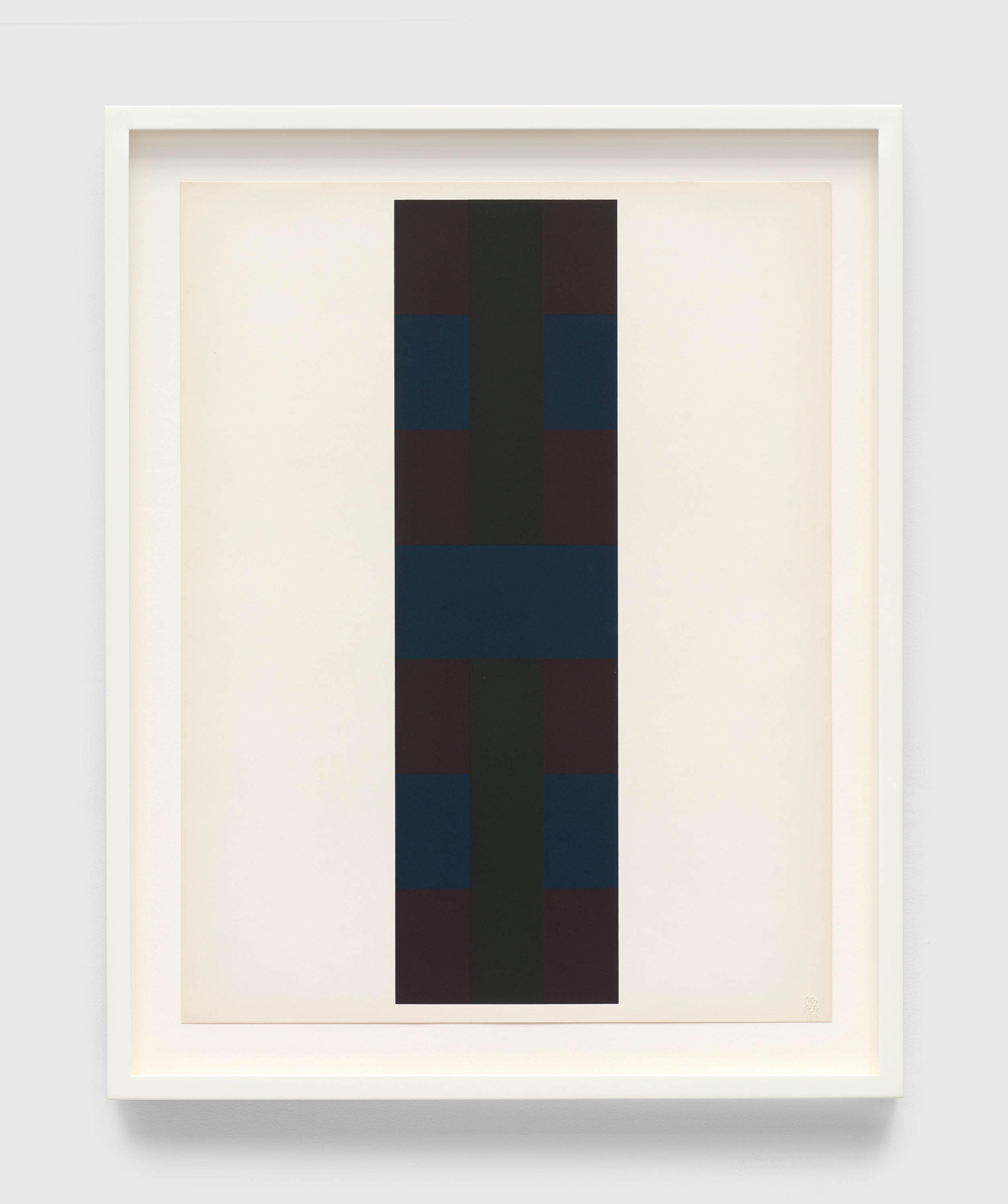
David Zwirner is pleased to present an exhibition of works by Ad Reinhardt (1913–1967) at the gallery’s 537 West 20th Street location in New York. Curated by Jeffrey Weiss and organized in collaboration with the Ad Reinhardt Foundation, the exhibition explores Reinhardt’s screenprints—a group of works that the artist created toward the end of his life—and his interest in translating the subtleties of his painted work into the print medium.

Explore

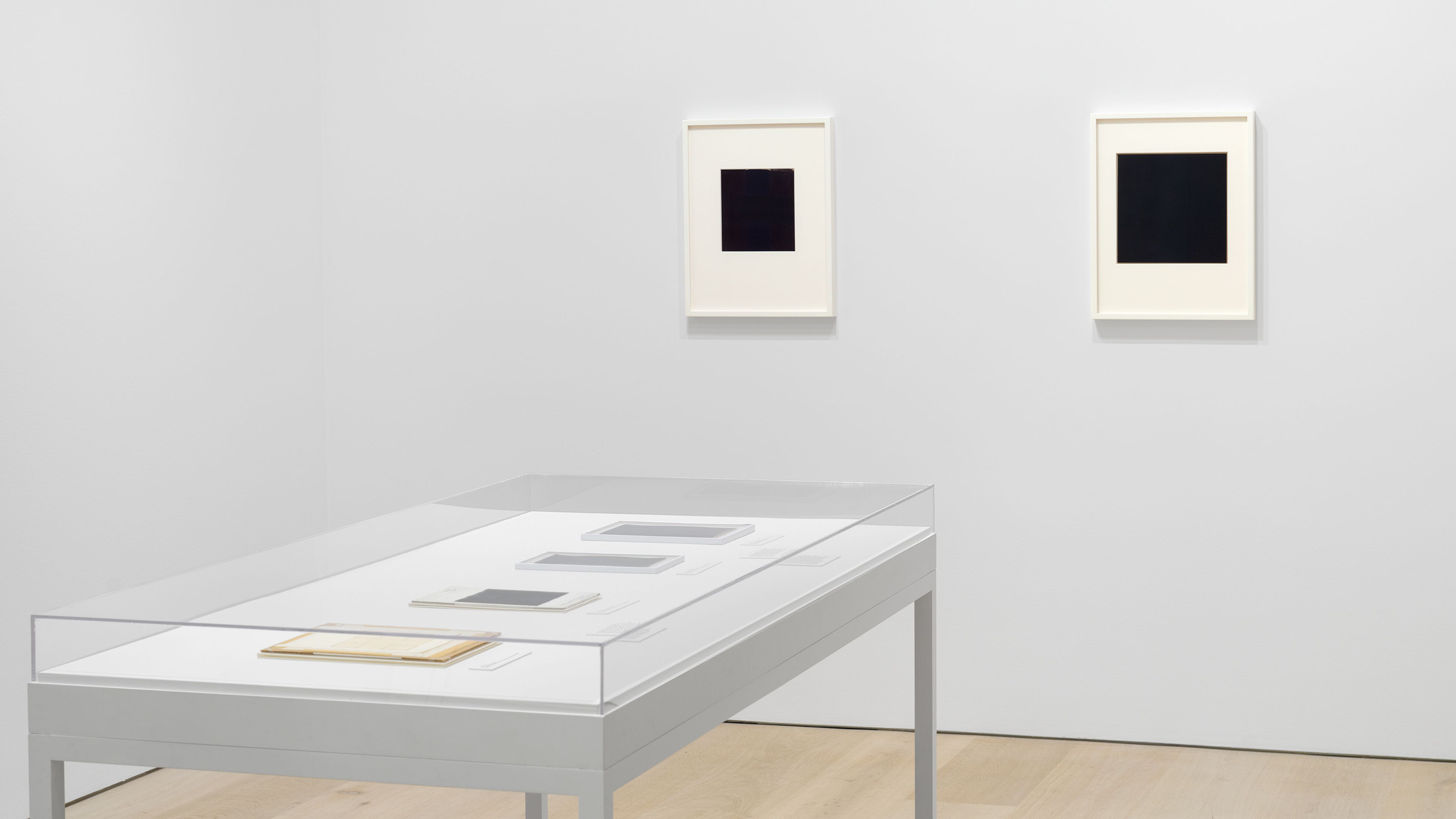
Installation view, Ad Reinhardt: Print—Painting—Maquette, David Zwirner, New York, 2024

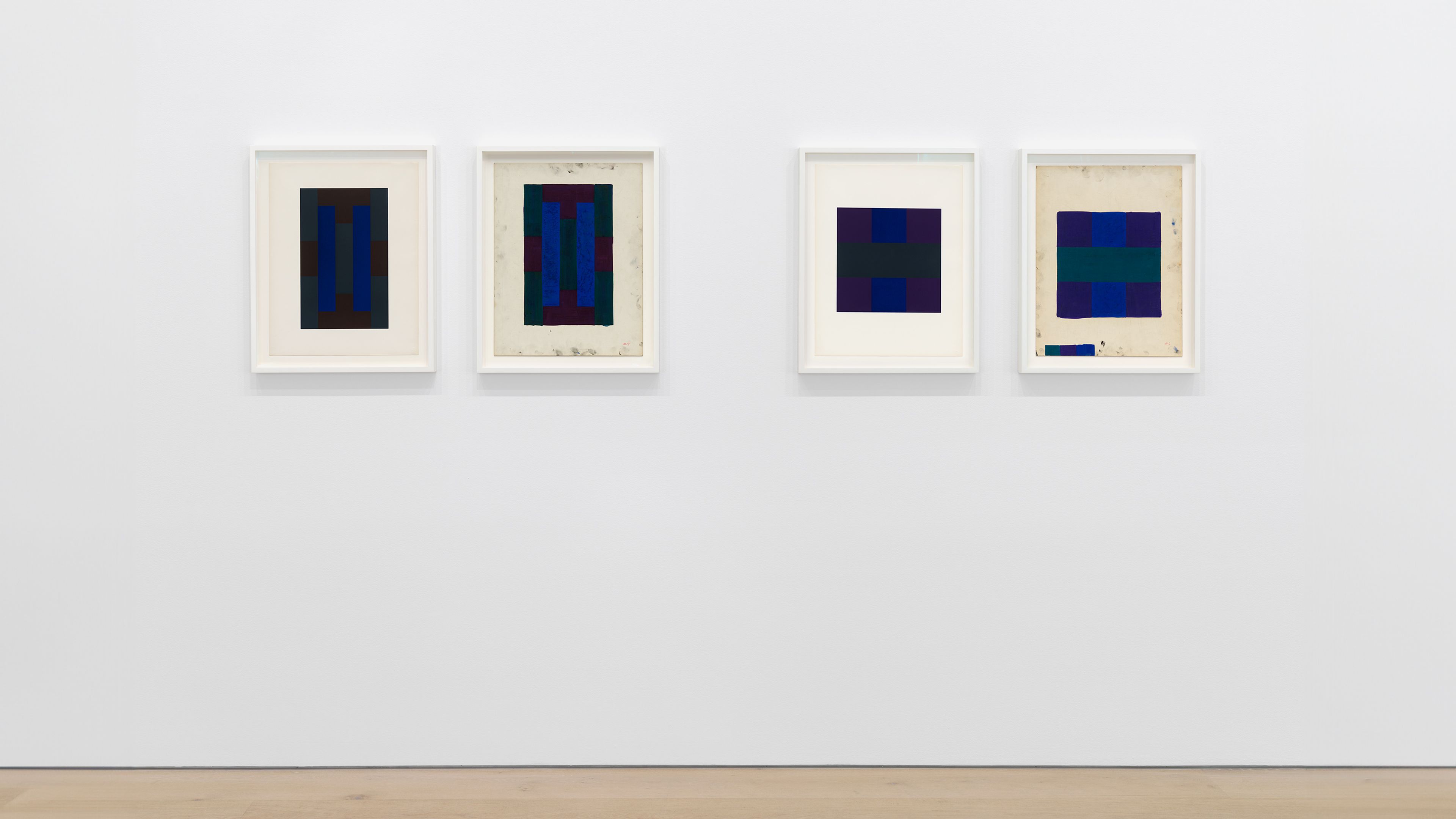
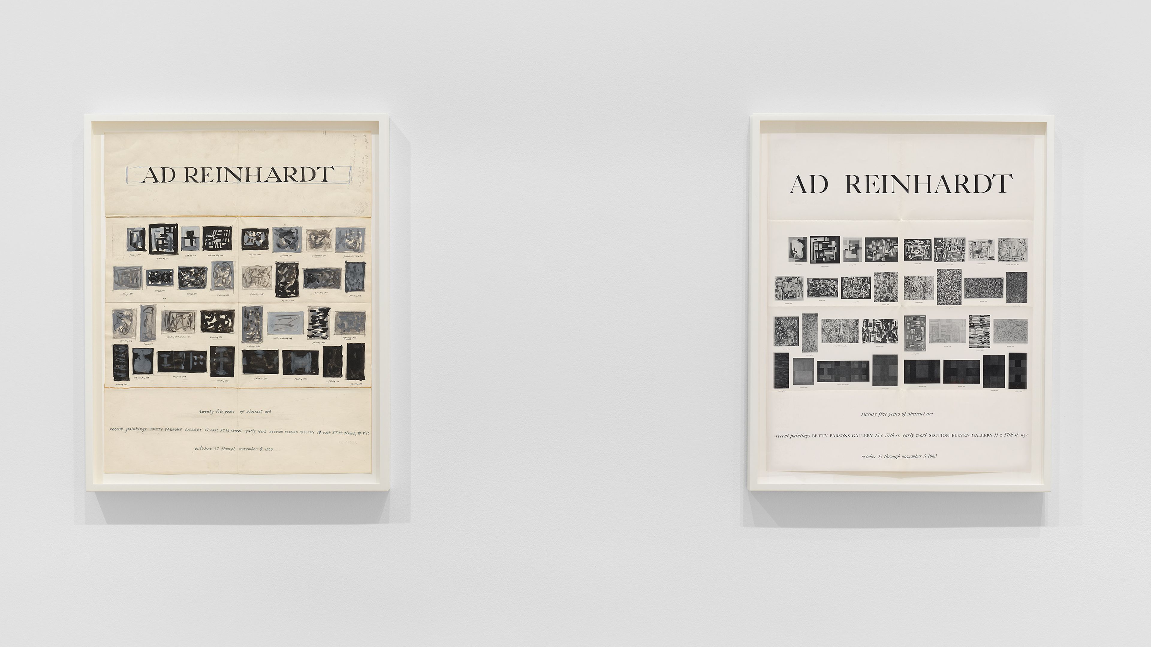
Installation view, Ad Reinhardt: Print—Painting—Maquette, David Zwirner, New York, 2024

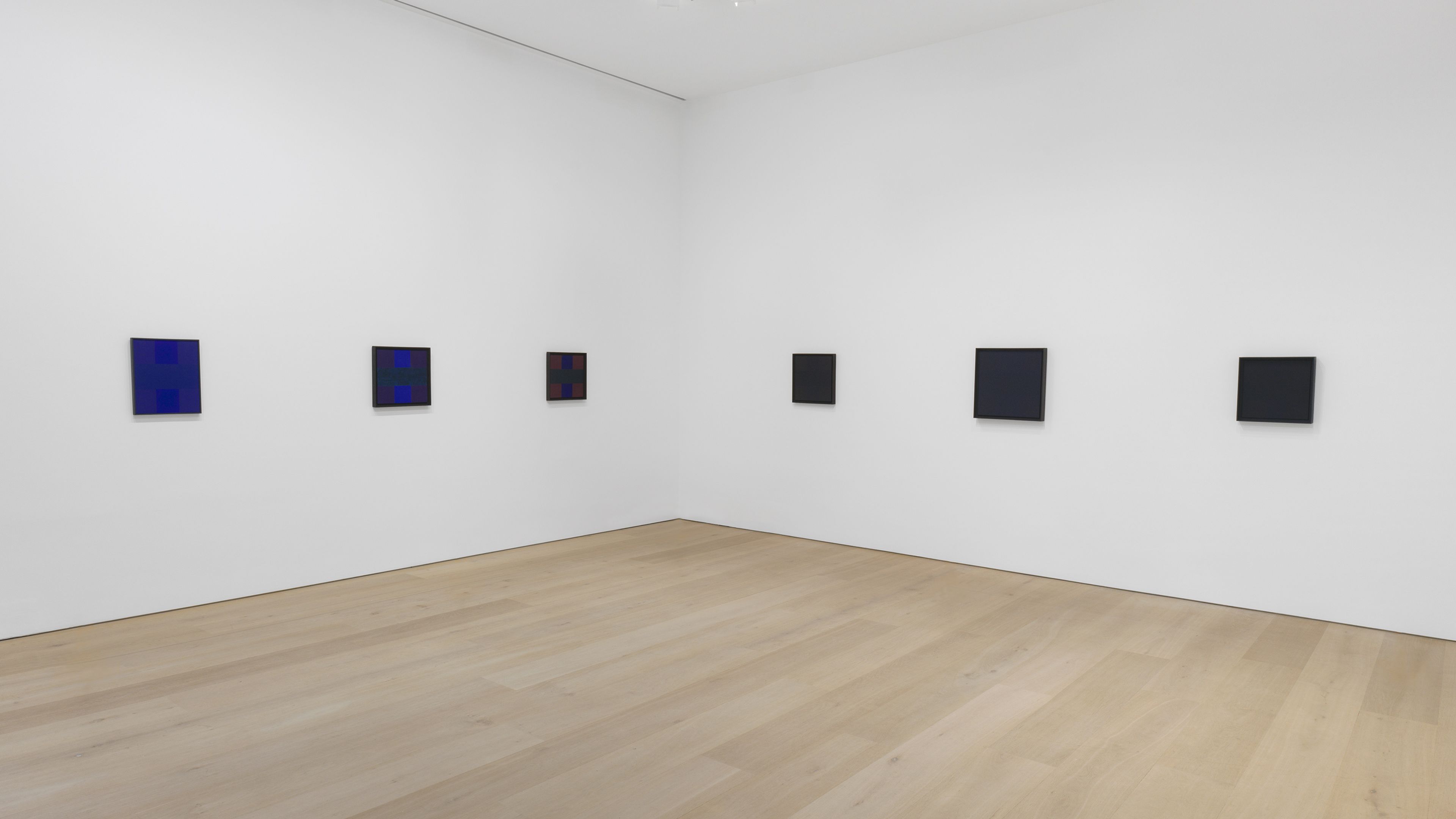
Installation view, Ad Reinhardt: Print—Painting—Maquette, David Zwirner, New York, 2024

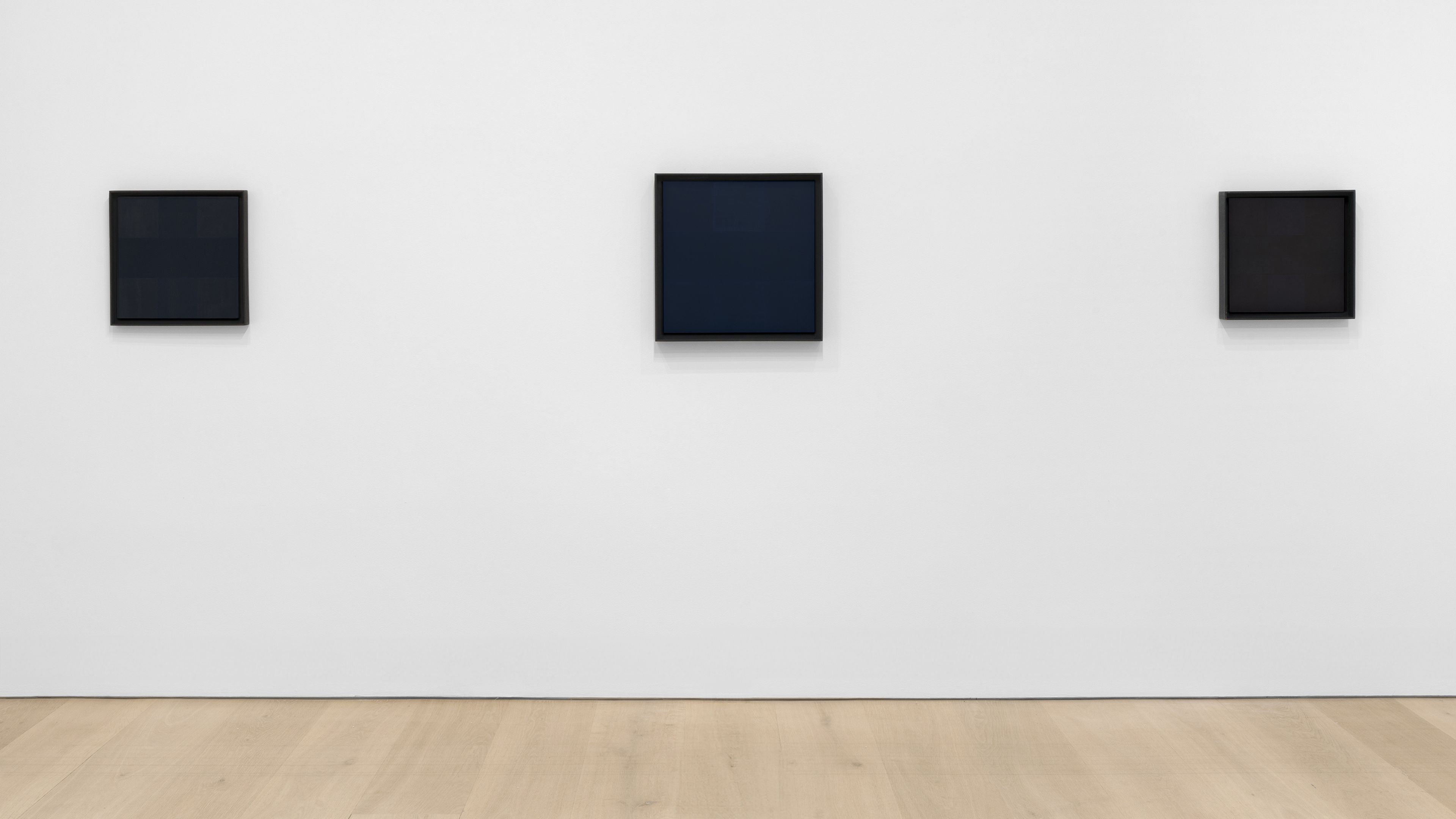
Installation view, Ad Reinhardt: Print—Painting—Maquette, David Zwirner, New York, 2024

Installation view, Ad Reinhardt: Print—Painting—Maquette, David Zwirner, New York, 2024


“I was born the year abstract art was born.... I was born for it and it was born for me.”

—Ad Reinhardt, 1966
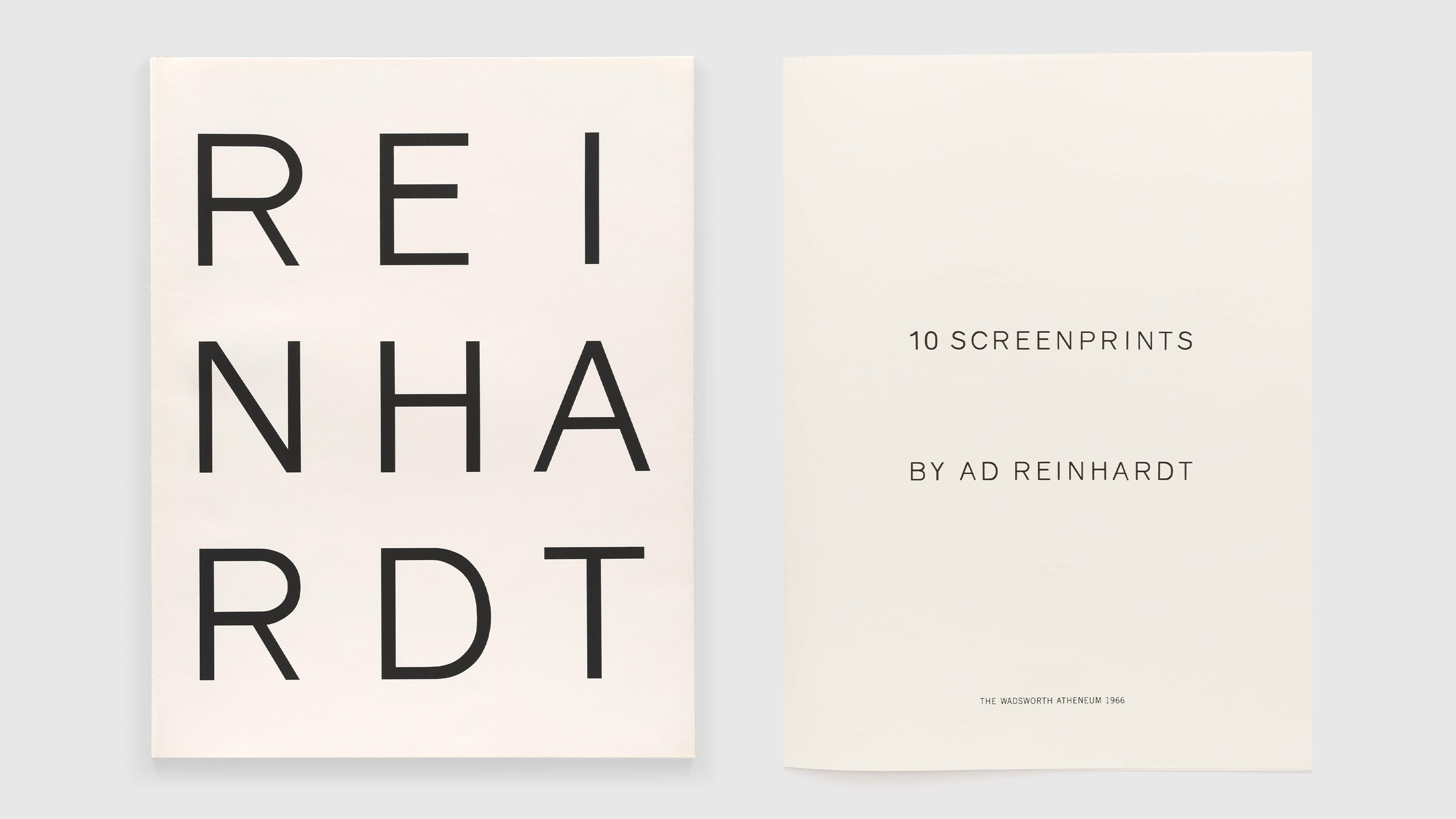
Ad Reinhardt took up printmaking late in his career, producing a small but exquisite body of screenprints. These include several individual screenprints for portfolios of works by various artists and, most prominently, Ten Screenprints by Ad Reinhardt, a monographic suite commissioned by curator Sam Wagstaff for the Wadsworth Atheneum in Hartford, Connecticut, and published in 1966. This exhibition examines the relation of print to painting in Reinhardt’s practice, including factors of process, replication, and scale.

*Unless otherwise noted, texts throughout this page are excerpted from independent curator and critic Jeffrey Weiss’s essay “Ad Reinhardt: Print—Painting—Maquette.” Read the full essay here.

Portfolio cover and front page from Ad Reinhardt, 10 Screenprints, 1966

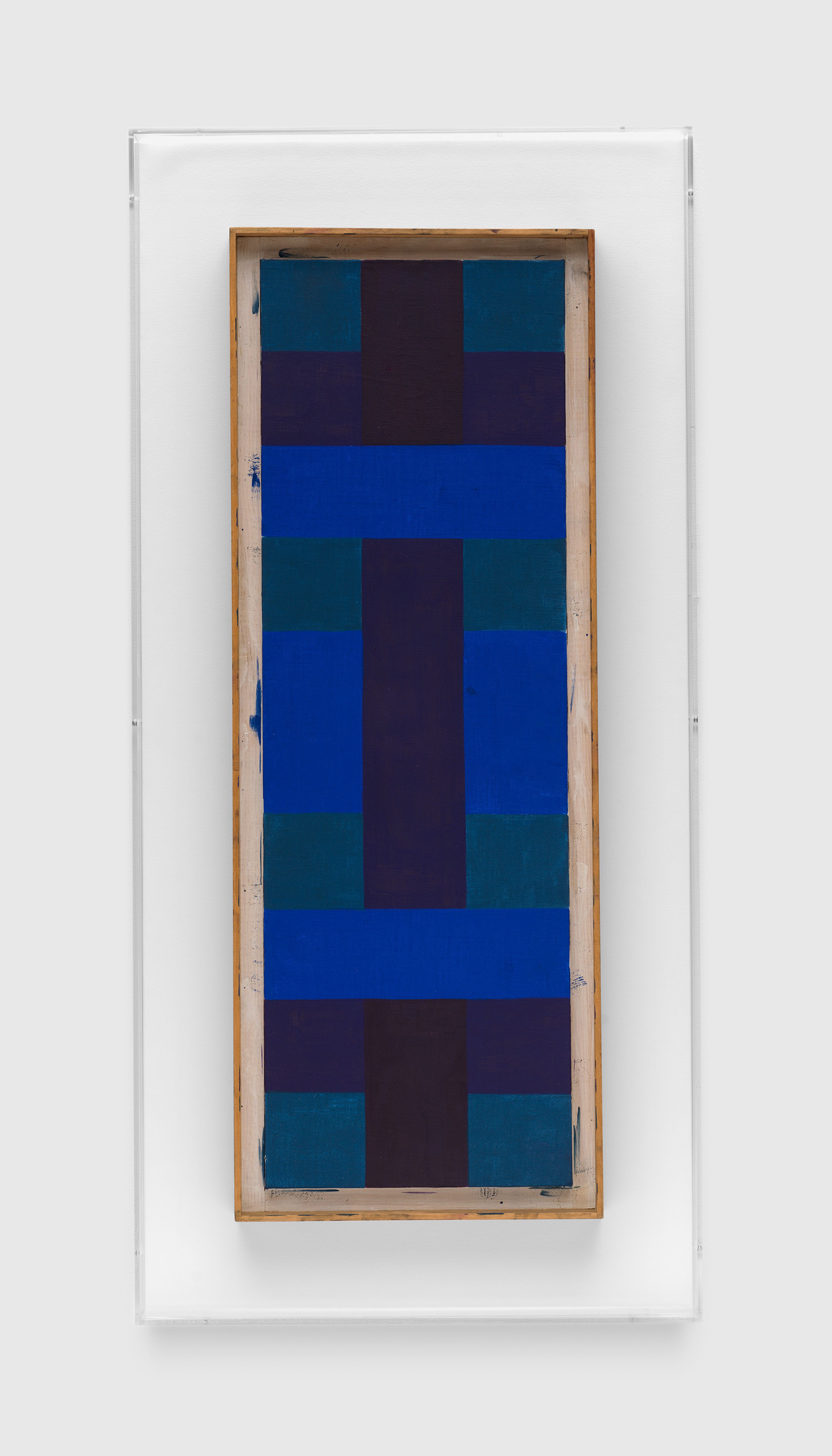
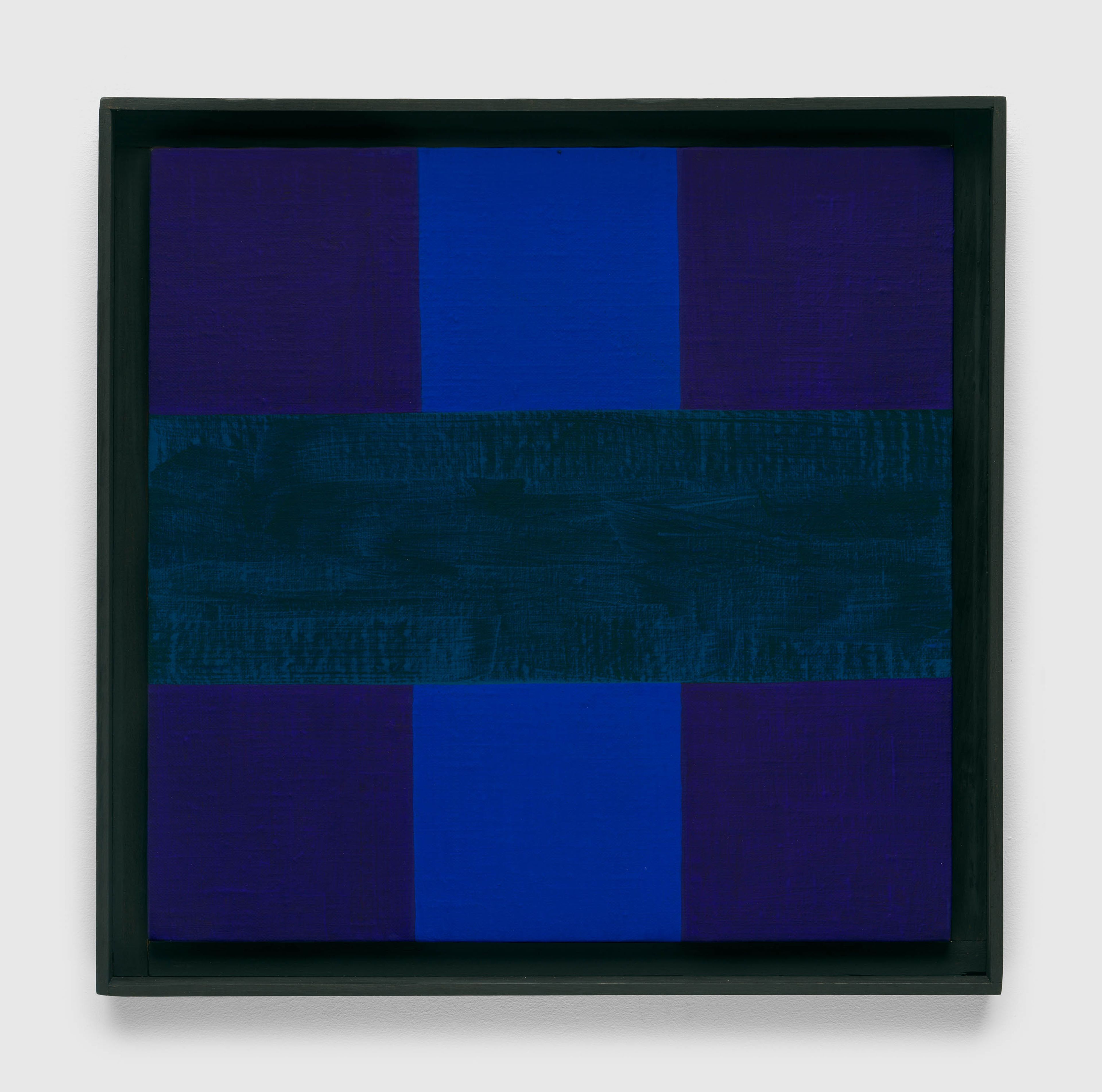
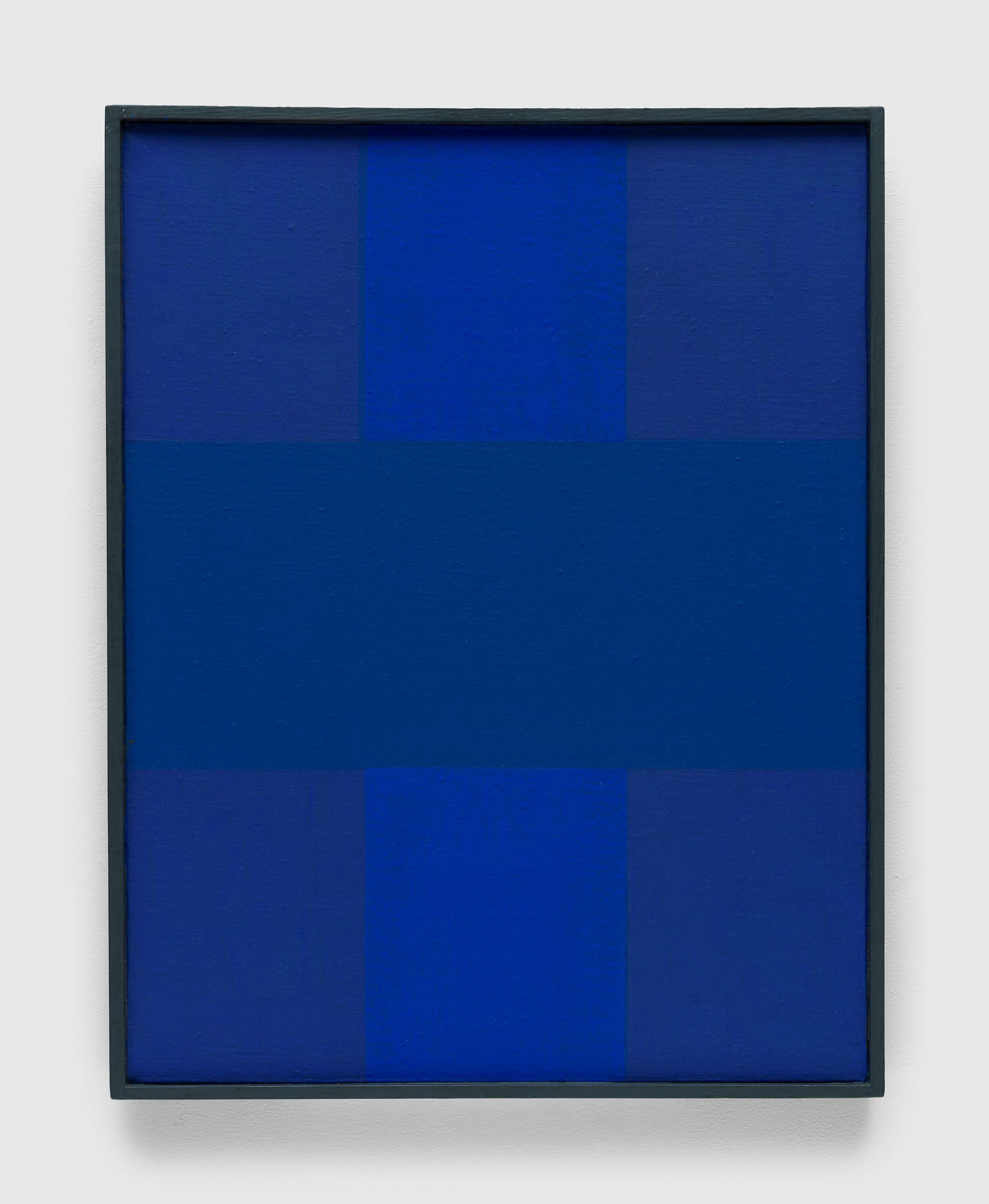
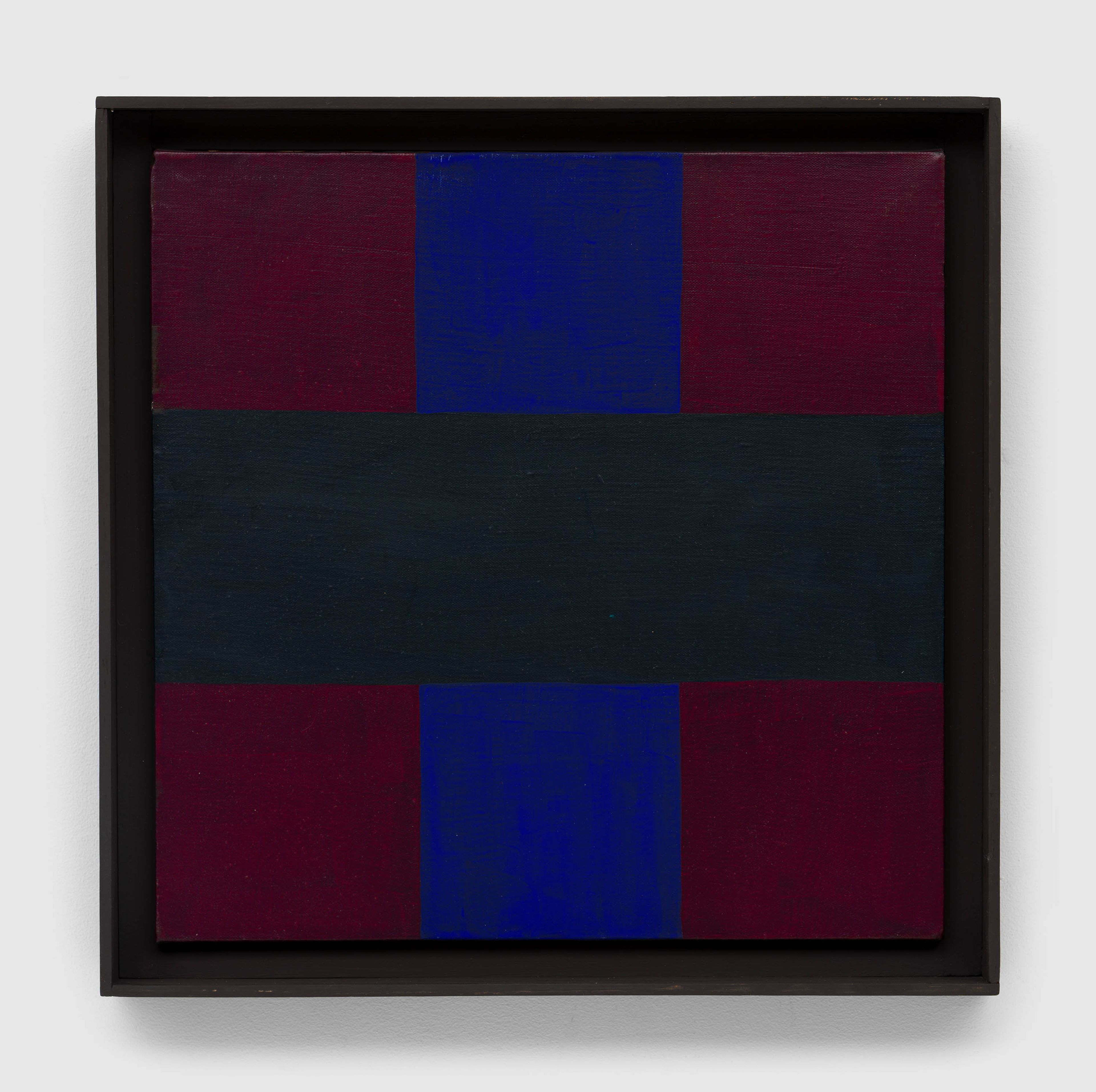
Since the early 1950s, the artist’s paintings had displayed a precise allocation of color and form. Surface structure is established by horizontal and vertical bars that interlock in strict—but not mechanically ruled—bilateral or tripartite configurations. Formats are alternately rectangular or square. Many of the works are monochromatic: red paintings, blue paintings, and “black” paintings, the latter composed of black mixed with red, blue, and green—colors so deep that the distinction among hues can take time to discern. In an unpublished note, Reinhardt called these paintings the “early-classical hieratical red, blue, black monochrome square and cross-beam form symmetries of the fifties.”

“He was the only New York school artist who never painted figurative works.... I was always impressed by the fact that his rejection of something was not because he could not do it, but rather he thought there were higher forms of creativity.”

—Barbara Rose, The Brooklyn Rail, 2013

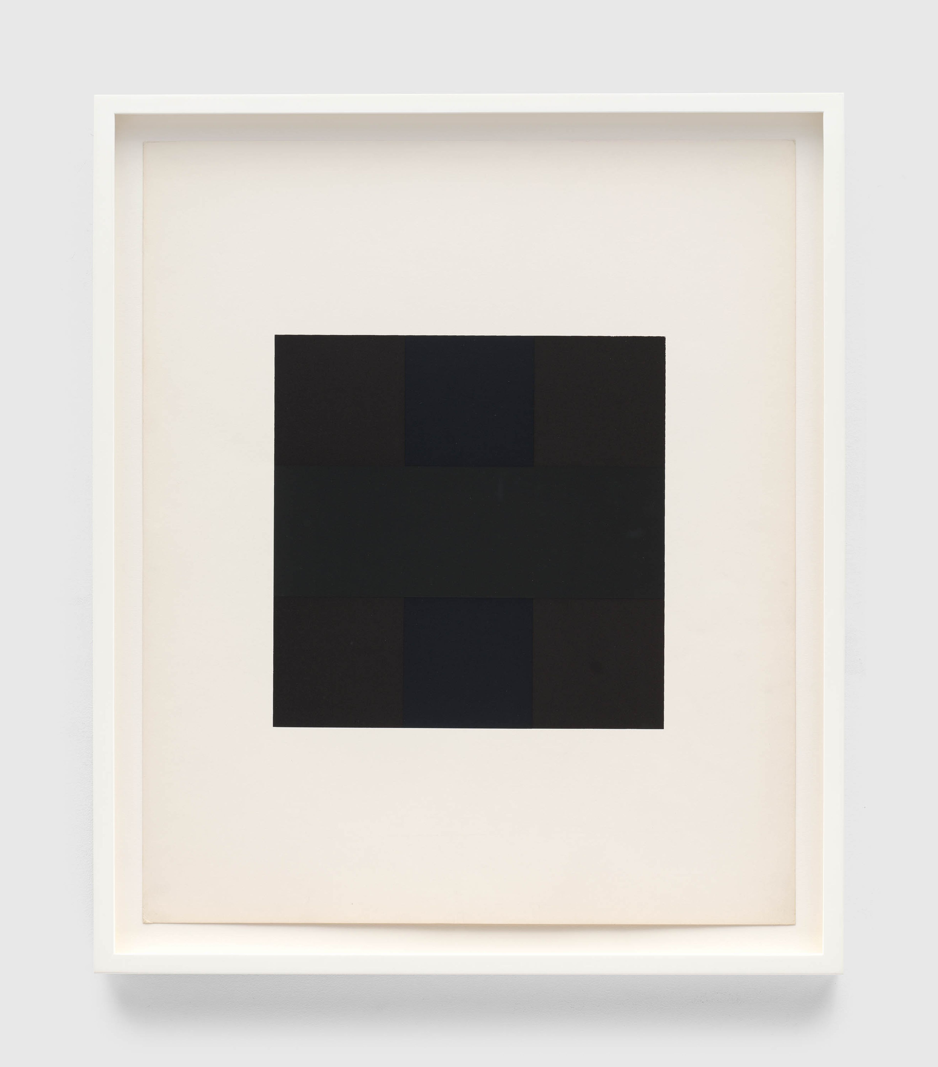
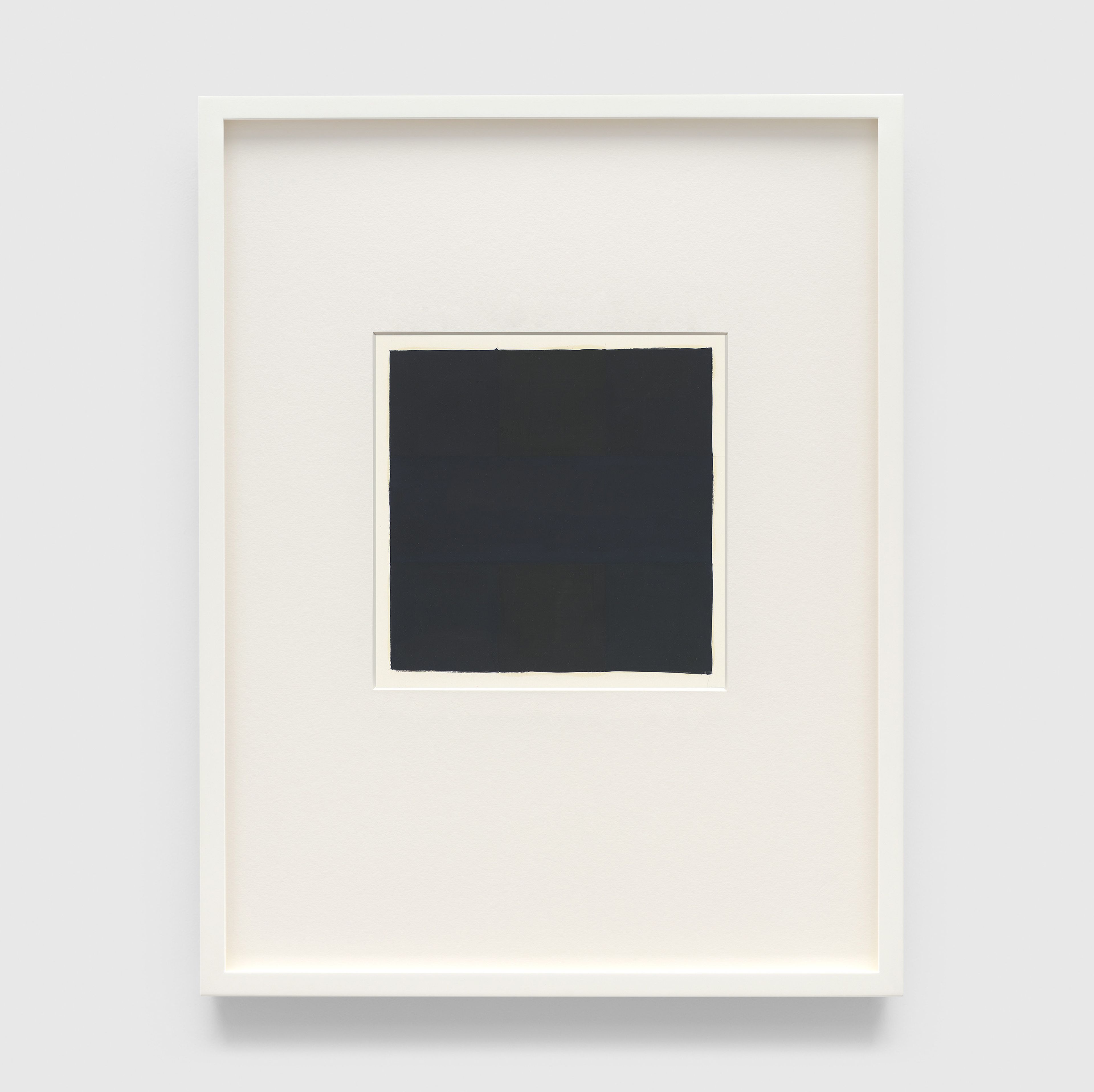
Reinhardt’s screenprints correspond to two types of painting. His first print, made for X + X (Ten Works by Ten Painters), a 1964 portfolio of prints by ten artists (also issued by the Atheneum), took the form of a black square.

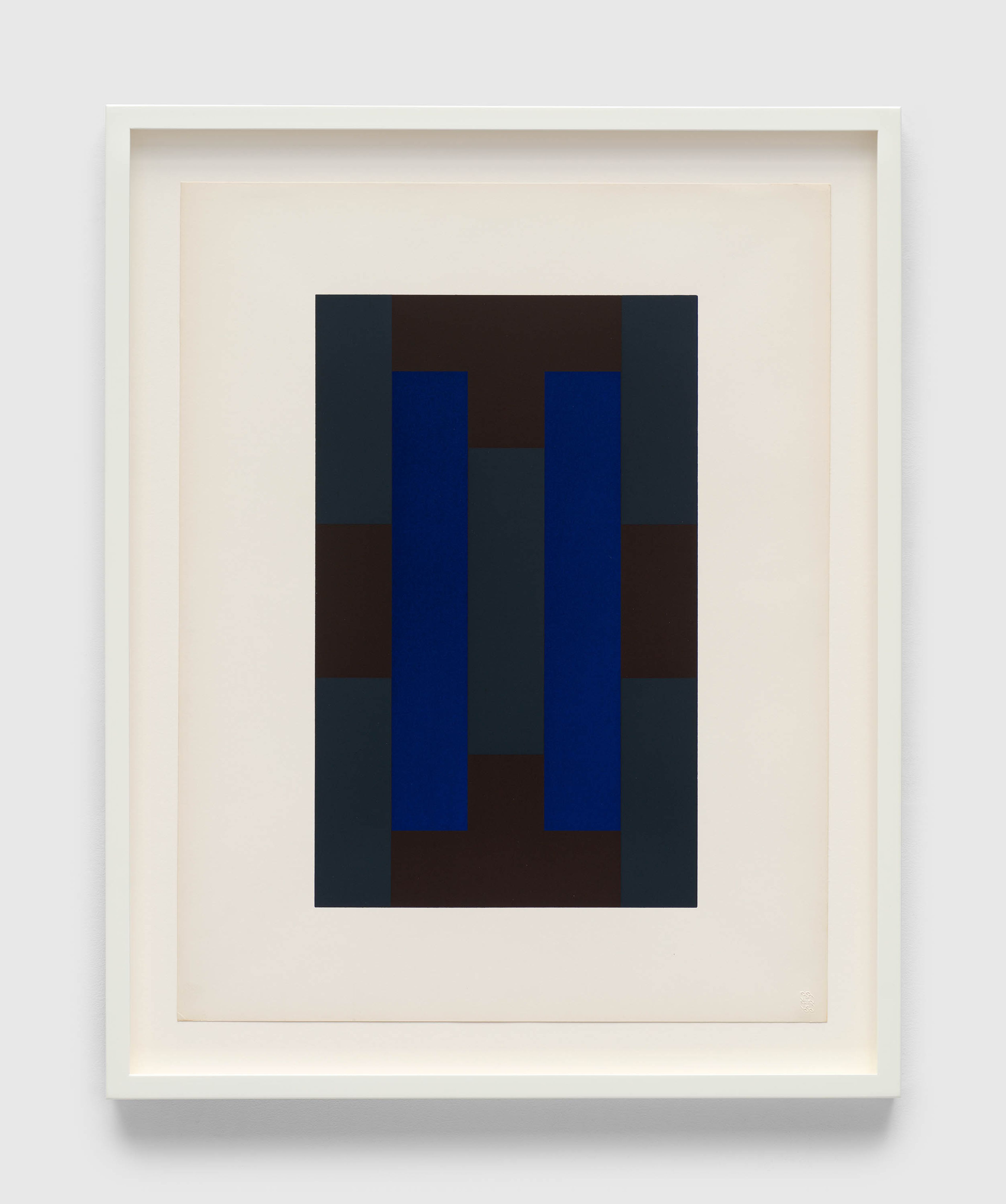
Conversely, most of the ten prints for the 1966 portfolio derive from paintings of the 1950s that are more complex in design and more explicit in color. There are eight vertical-format images; two are square, including the last print in the sequence of ten, which is another black square.

In the context of Reinhardt’s work, the screenprint afforded an evenness of color, value, and surface and a straightness of edge not natural to working freehand.

“Considering the refinement of Reinhardt’s painting practice, he would not have undertaken the full portfolio if he hadn’t already learned—from making his first print—that it was possible to apply his exacting standards to the screenprint medium.”

“Reinhardt’s screenprints are, in and of themselves, hieratic icons of color and form, almost unique in printmaking of the era for being at once sumptuous and austere. Yet, as images, they are derived from his painted work.”

Ad Reinhardt, color study for the portfolio 10 Screenprints, 1966 (detail). Yale University Art Gallery, New Haven
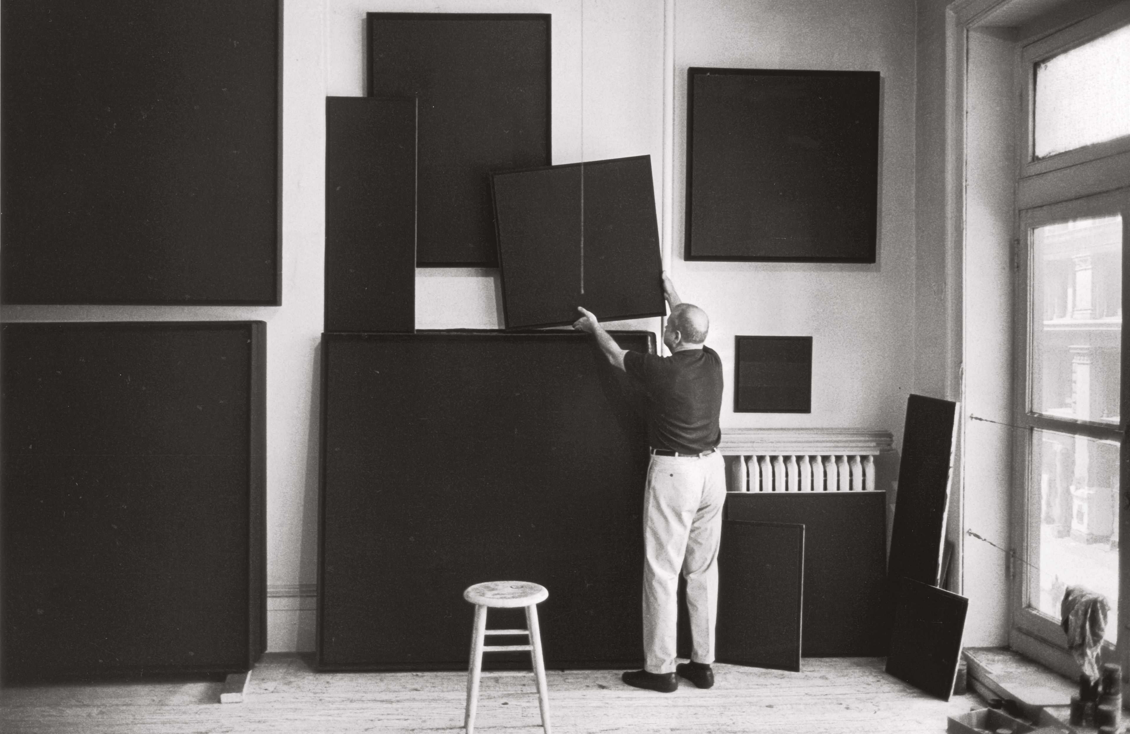
Reinhardt did not seek out printmaking but came to it by invitation. Anna Reinhardt, the artist’s daughter, recalls that he considered it an engaging challenge. It was, as a technology, also somewhat familiar. It is likely that he welcomed printmaking as an opportunity to bring his work to a broad audience as well.

A photo of Ad Reinhardt from the same period: Ad Reinhardt, at 732 Broadway studio, NYC, 1966. © John Loengard—The LIFE Picture Collection via Getty Images

“Reinhardt’s experience as editor and art director of various newspapers, periodicals and journals ... is likely to have contributed significantly to his understanding of the nature of the process of screenprinting, multiples, and commercializing in the 1960s artworld.”

—Elizabeth Reede, “Ad Reinhardt: Visual Perception and the Screenprint Portfolios,” 2011
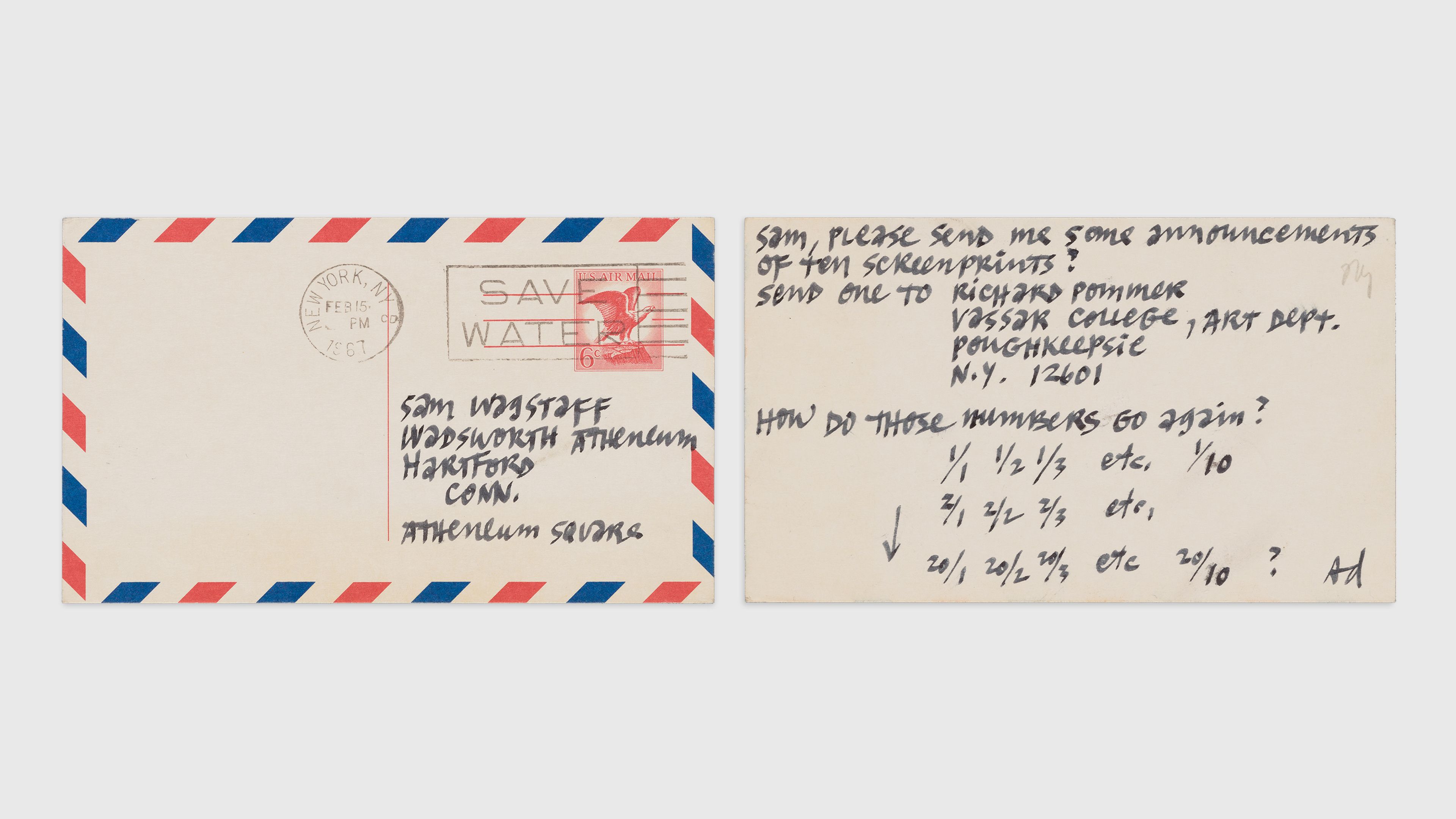
Recto and verso of a postcard from Ad Reinhardt to curator Sam Wagstaff, February 15, 1967, Samuel J. Wagstaff Papers, c. 1932–1985, Archives of American Art, Smithsonian Institution, Washington, DC
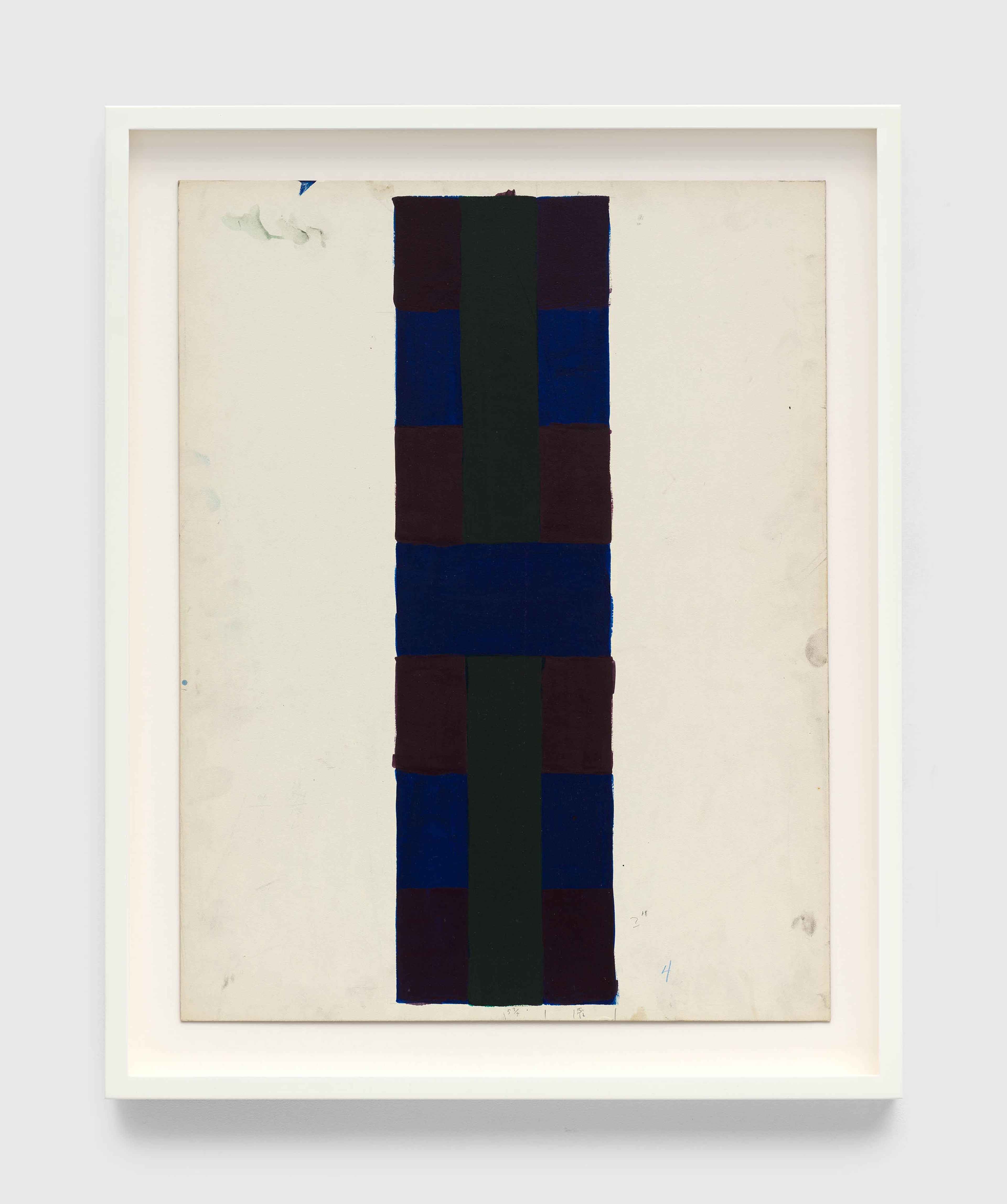
Reinhardt made two kinds of maquette to which the printer would refer when creating the screens. (A maquette, as opposed to a study, is a template for the printer to follow in producing the finished print.) The first kind, a painted work on paper, serves as a model for color. Nine of these maquettes for the print portfolio are extant. The dimensions of each—both sheet and image—closely match those of the print to which it corresponds.

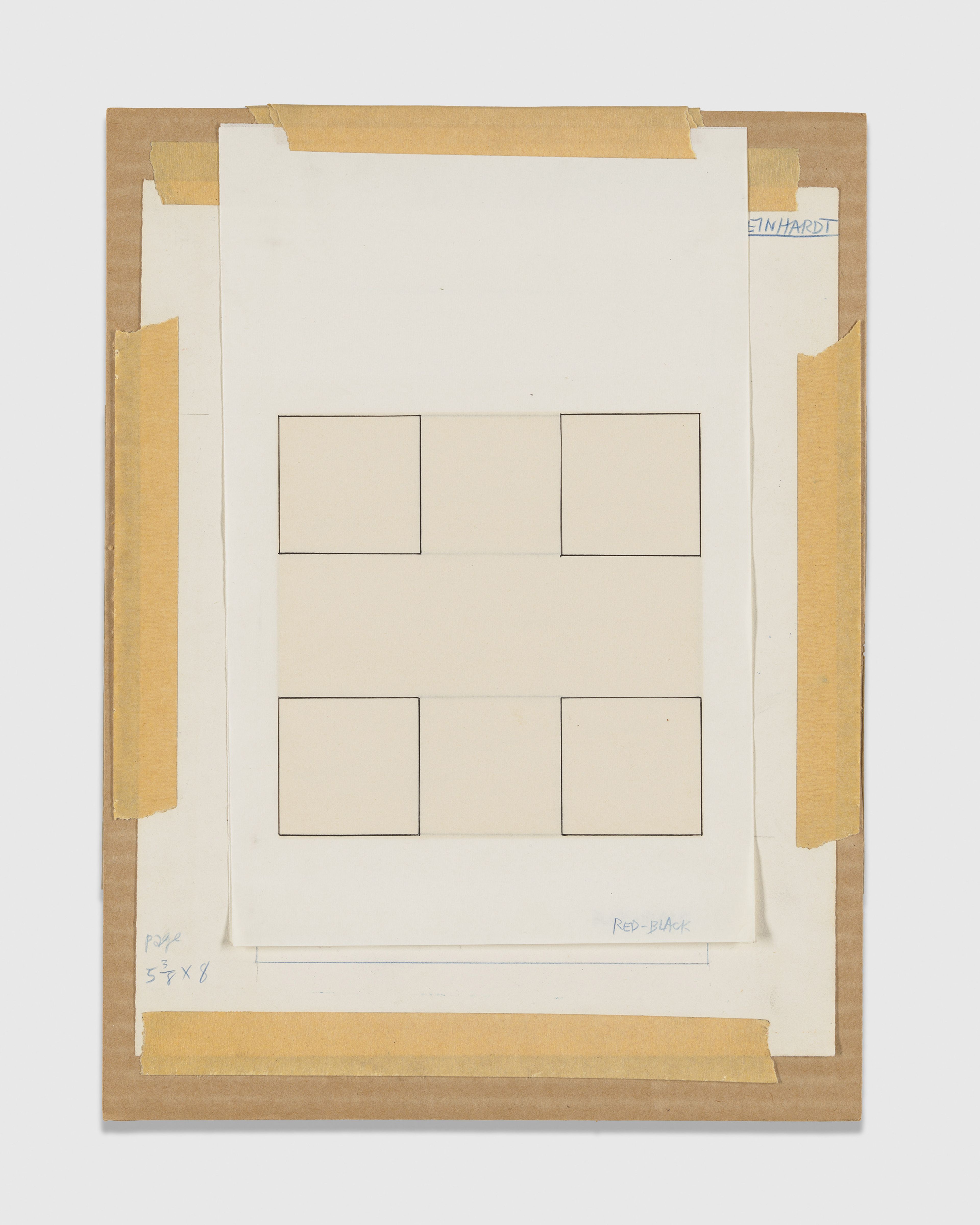
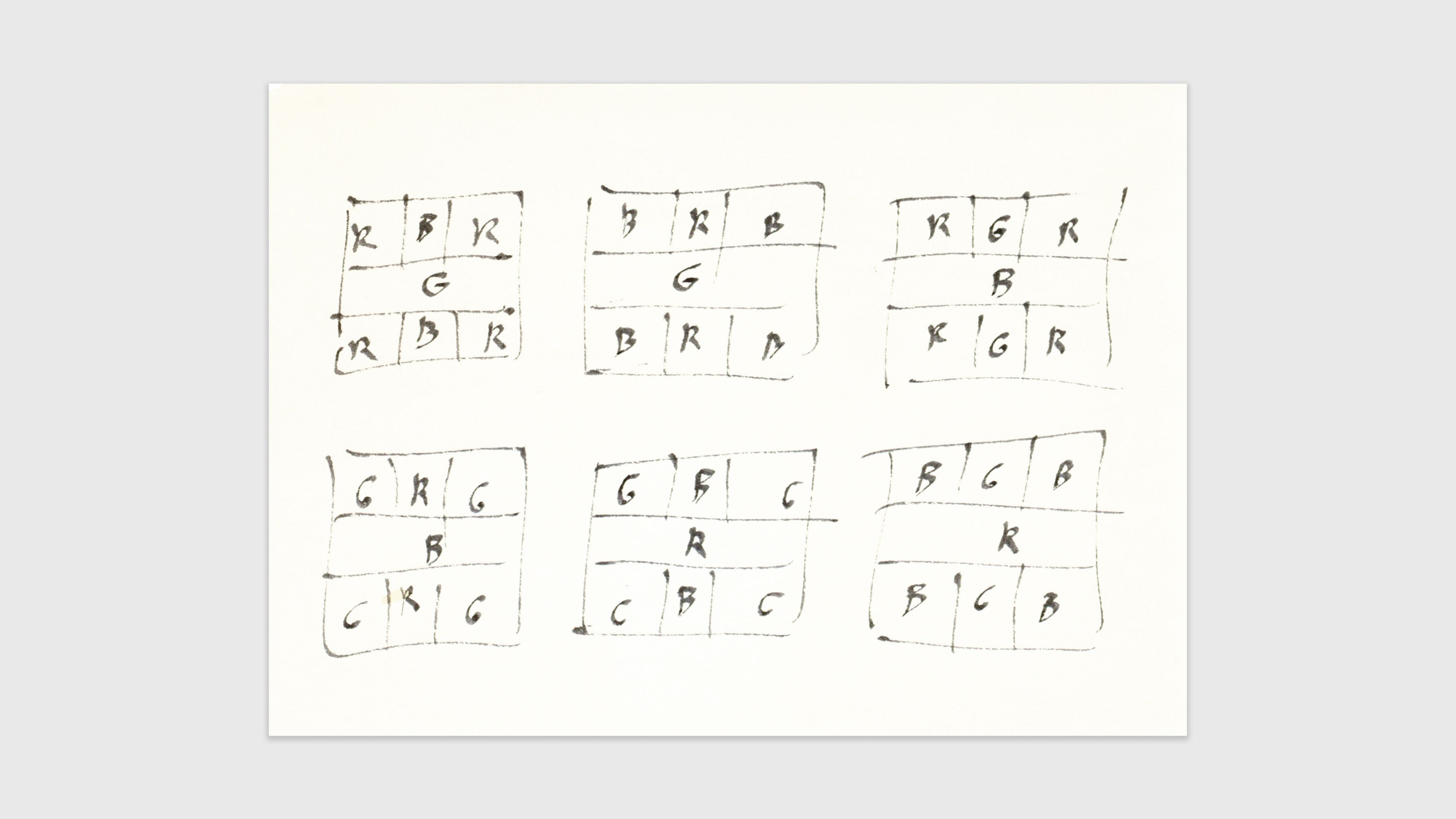
The second kind of maquette is a ruled diagram of the design, each section inscribed with a letter or number indicating placement of color. The maquettes are a mediating device through which the screenprints approximate, rather than imitate, Reinhardt’s paintings. All of this is to say that the relation of painting to print is one of equivalence. The second kind of maquette supports this idea. Many of the painted maquettes are somewhat broadly executed; their primary role concerns color and surface, not design. Instead, the diagrammatic maquette functions to make the coordinates of the design as exact as possible, minus color.

Reinhardt applied this kind of diagram to painting as well. One was made for a series of six small black paintings on paper, 12-inch images on sheets measuring 26 x 20 inches overall. The paintings represent the six possible permutations of the contiguous distribution of red, blue, and green (with black) within Reinhardt’s standardized design and are numbered accordingly. The drawing contains quick sketches of each of the six options.

Ad Reinhardt, Drawing, c. 1960. Ad Reinhardt Papers, Series 6: Artwork, c. 1946, 1950, 1961, Box 4, Folder 12, Archives of American Art, Smithsonian Institution, Washington, DC

Installation view, Ad Reinhardt: Print—Painting—Maquette, David Zwirner, New York, 2024


Installation view, Ad Reinhardt: Print—Painting—Maquette, David Zwirner, New York, 2024


“For Reinhardt, the screenprinting process seemed to offer a close proxy for oil painting with the materials’ ease of manipulation and experimentation, but also with the added benefits of efficiency and control.”

—Elizabeth Reede, “Ad Reinhardt: Visual Perception and the Screenprint Portfolios,” 2011
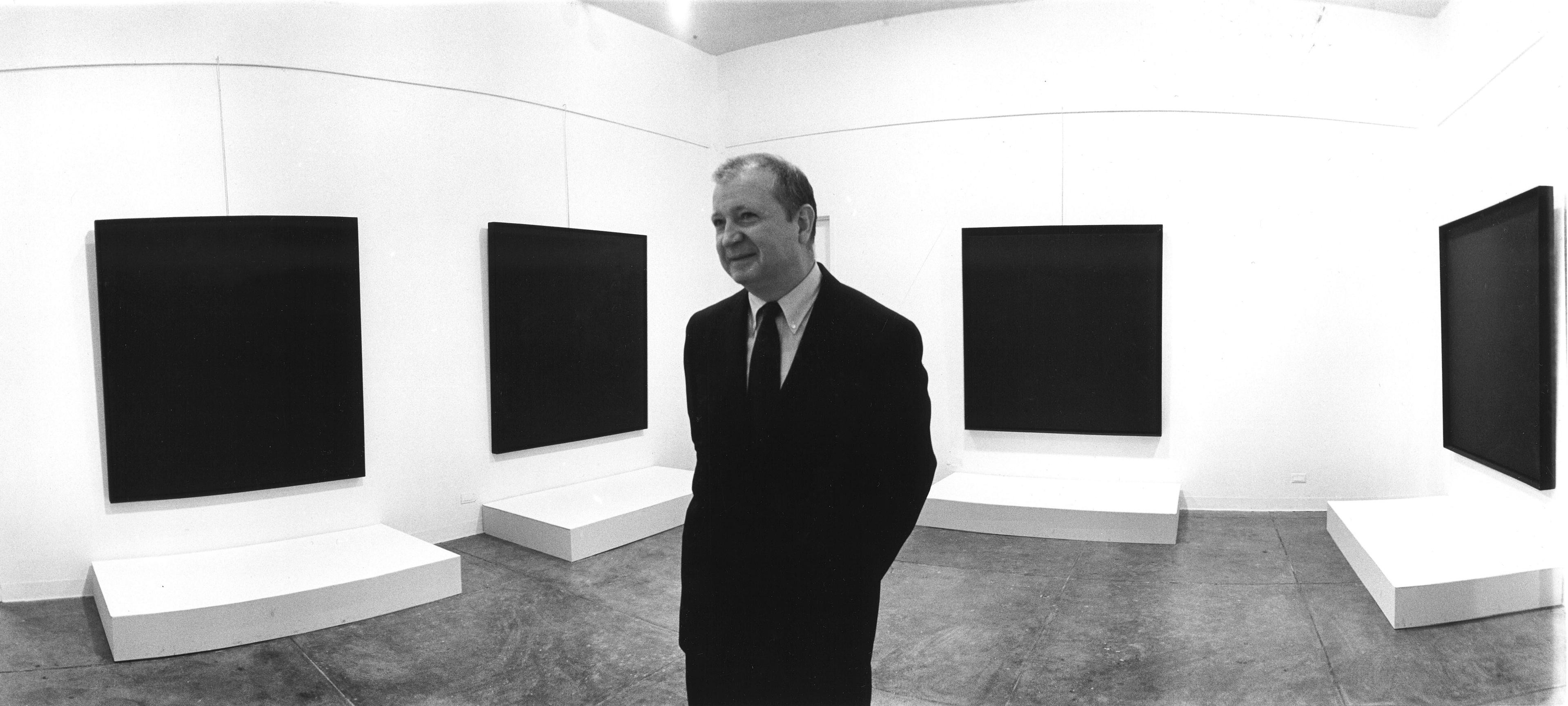
Most of Reinhardt’s classic-period canvases measure in height or width roughly three or four to eight feet, even beyond. Yet he also made many small paintings, works on canvas that correspond in their dimensions to these works on paper, as well as to the prints (and to their painted maquettes). From small to large, configurations of design remain identical throughout, being scaled up or down accordingly.

Ad Reinhardt at Betty Persons Gallery, March 1965. Photo by Robert R. McElroy. © Robert McElroy/Getty Image

“Anyone who loves modern painting cannot get around Ad Reinhardt. You have to relate to him in some way or another.”

—Marlene Dumas, The Brooklyn Rail, 2013
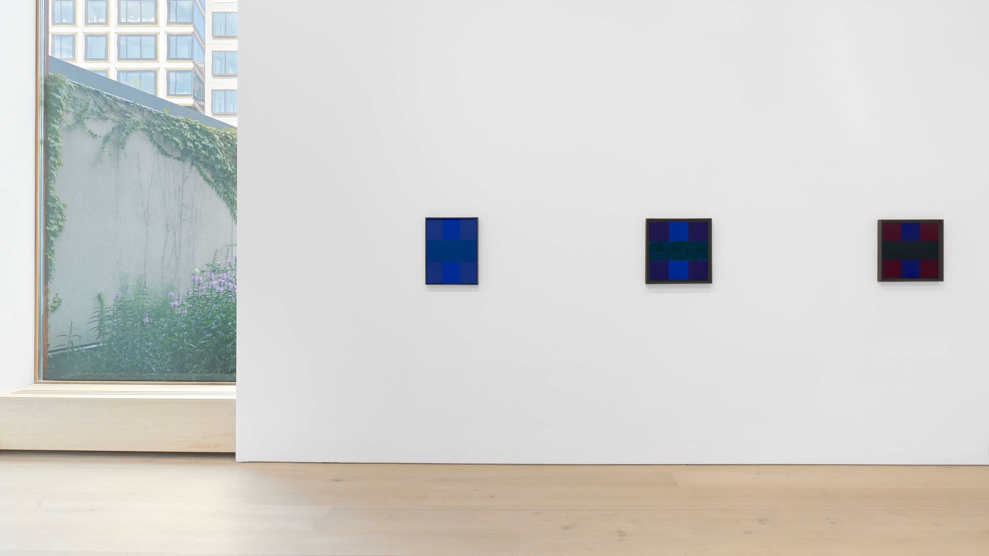
Installation view, Ad Reinhardt: Print—Painting—Maquette, David Zwirner, New York, 2024

Installation view, Ad Reinhardt: Print—Painting—Maquette, David Zwirner, New York, 2024

Installation view, Ad Reinhardt: Print—Painting—Maquette, David Zwirner, New York, 2024


Interested in works by Ad Reinhardt?