October 29, 2018
Equal parts oral history and analysis of craft, Jarrett Earnest’s What it Means to Write About Art, out now from David Zwirner Books, offers an unprecedented overview of American art writing. Thirty wide-ranging conversations with critics, historians, journalists, novelists, poets, and theorists—all of whom approach the subject from unique positions—illustrate different ways of writing, thinking, and looking at art.
We asked Earnest to do one more interview, with the book’s designer, Mark Thomson. This is the second part of the interview. You can find Part I here.
Something I thought a lot about was how to make this book more than a collection of thirty interviews, feeling that it should be a larger argument, a whole. Your design intuited that in a really deep way, and I’d love to know more about how you approached it.
The interviews come across as texts more than as questions-and-answers. Perhaps this is because the subjects’ answers run on directly from the questions, without the distancing of a line space—the conversation seems more intimate. I think it’s also because the general design of the book is quite classical, certainly in the positioning of the type area on the page. That gives it all a sense of solidity—the spread is not trying to do anything untoward or showy, it’s just there. There’s something in this—the type area of the classical page is like a window or door; not a Georgian window or a frosted glass door, just "window" and "door." It’s an opening, and one that is intuitively understood by writer, designer, and reader.
There is also a kind of unanimity to the procedure for each text. The opening pages are identical in each case, not too much fanfare. I thought about switching some of the elements around occasionally for a bit of variety, but that idea fell off pretty quickly. Why do you need variety? I felt it would be a distraction; that the individual arguments coalesce into a bigger picture anyway, and any attempt to individualize the texts would be disrespectful. I’m not that keen on things that make design more palatable or accessible. It should be supremely accessible anyway—it’s a language we speak, expressed in a language we know. If it’s well done it is accessible; if it isn’t well done, no amount of dressing will make it palatable.
We went back and forth on the colors for the cover—because I’m neurotic about color, as some of the interviews reveal—but you had the design almost right off the bat. What are your thoughts on the cover and what did you want it to communicate?
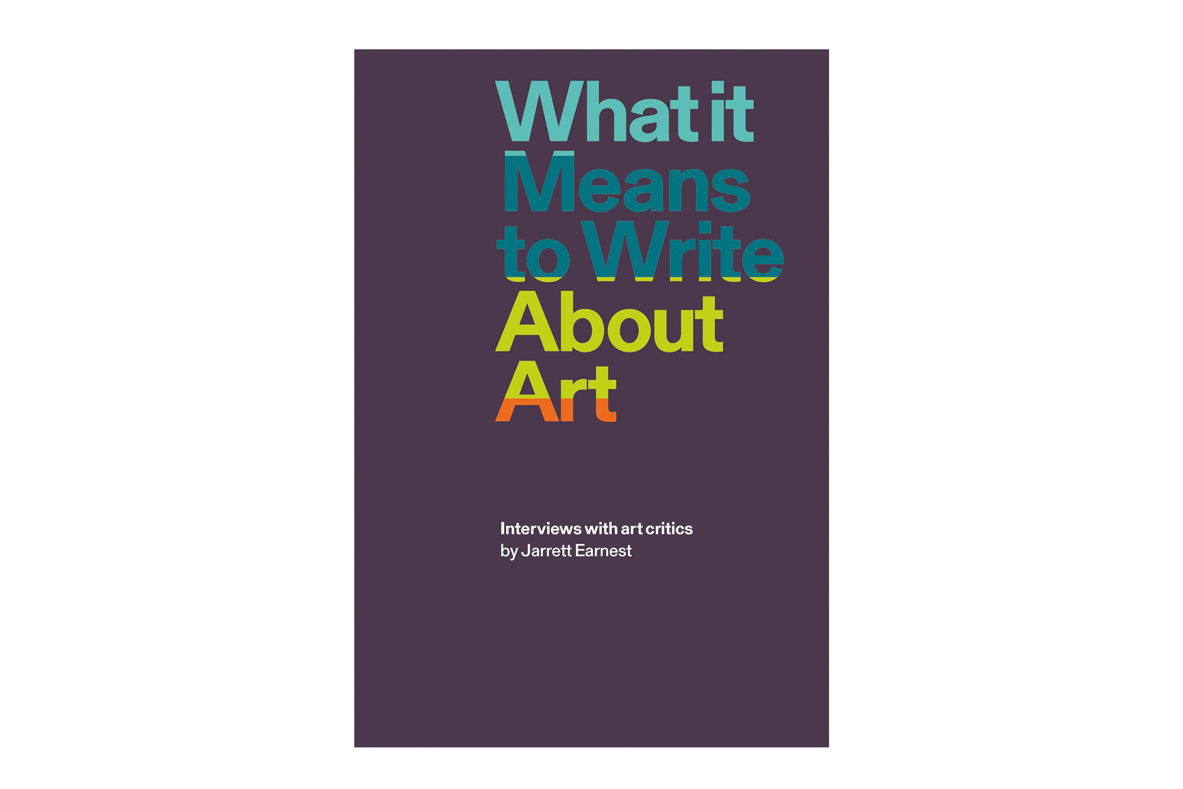
It was very straightforward. To an English designer, the title capitalization looks quite emphatic. To a French designer even more so. The fulcrum of the title is to Write, and it was clear that the rest of the title could be distributed across lines so that the phrase to Write was the only part that didn’t start with a capital letter. (Also on the title page, I stretched the title across the spread, with the phrase to Write broken by the gutter.) Hence the stack of words, with the left edge holding them all together. The rest of the front cover is just about space, weight, and impact: where you want the weight of the "text" to be. I wanted it in the optimistic place, toward the top and the right.
Color is another question. I’m a fan of white, probably because I’ve heard people say white gets dirty too many times. I don’t mind it getting dirty! It depends on how you look after it. Same with lamination: I’ve made a few unlaminated books and yes, they get a little patina, they soften. I like that. How books feel and how they behave over a period of time and use is actually something to think about and plan for. It doesn’t stop at the point of sale! The great current example of this thinking is Robin Kinross, whose Hyphen Press has produced many books with sensitive bindings, sewn and glued with an eye to the longer future.
You and I discussed the idea of some color in the cover and we shared a few, fairly random picks. From my point of view, I didn’t want there to be a literal relationship between color and words, or between figure (as in the title) and ground. I don’t like the idea of coloring in words, at least not without some rationale. So I distributed the color according to another system altogether; there is a completely different logic to the color distribution than to the title typography and overall layout. That color logic rolls round onto the spine as well—it’s the kind of thing that is usually considered a "no way" in publishing.
I’m not sure that I wanted it to communicate anything other than itself. Of course, it’s an abstraction. It would be wrong to attempt to make something "emblematic" of the content. It should come straight from the content, with the minimum of interference. To make something "emblematic" implies a kind of subservience to the idea of selling something through its cover, an idea I find hard to get on with. I don’t want to be sold something, especially when the language and the subject are things I care about deeply. I’d rather see the reality than the proposition.
If a "design philosophy" could be divined from a close examination of this book, what would it be? Do you think you have one more broadly?
I’m not sure I would call it a philosophy. It’s more of an orientation. It begins and ends with an engagement with the content, and this goes for everything. It’s impossible to design a great book with mediocre content. It’s very possible to wreck a great book with mediocre design. It’s that way round, and the place of the designer is right there: being a book designer is not about superficial things. It’s a delicate, quiet space deep down in the core of the material. It’s touched only by sylphs and echoes; it’s immaterial. It solidifies only when it rises to the surface, and that’s the book.
In a way my philosophy is not to have a "philosophy." Designing is not—and for me never has been—a search for identity. It cannot be that the designer says "I do it this-a-way," because "it" is alive and always changing. This always comes up when people talk of design as problem solving. Well, I’m going to solve this identity problem right now: you don’t need a problem to be a designer. It’s all to do with the nature of time. There are many solutions to many problems, and the moment your solution hits the atmosphere, it’s part of the next problem. The idea that the designer is some kind of self-appointed solutions architect is a complete anathema to me. We don’t need any more people who are right! (By the way, I love the Frank O’Hara quote on the flap of your book, "To be right is the most terrific personal state that nobody is interested in.")
I think being a designer, certainly a book designer (and I know this is a very small and potent niche), is primarily about preparing yourself to be open to material. The greater the engagement, probably the better chance the book will have of being a full expression of the content. One of the pleasures for me over time has been engaging with work that I hadn’t previously cared for that much and discovering its beauties through the process of making a book. This happened for me with Georg Baselitz: Collected Writings and Interviews, published a few years ago by Ridinghouse. Designing that book was a revelation. But this happens a lot.
Just as the location of design is intangible, the role of the book designer is to be transparent. There’s nothing worse than overdesign. It can manifest itself in tiny things too. If the motivation is in any way to strike a pose or to give something a "style," then it’s corrupt. Style is for fashion and magazines and hair, not for design. Designing is not styling.
I have believed for a long time that being a book designer is about getting the content up there in the best way it can be done and then getting out of the picture. It’s a silent way and it’s not obvious at all when you’re starting out. It becomes clear over time, through repeatedly asking questions of yourself in the face of new material.
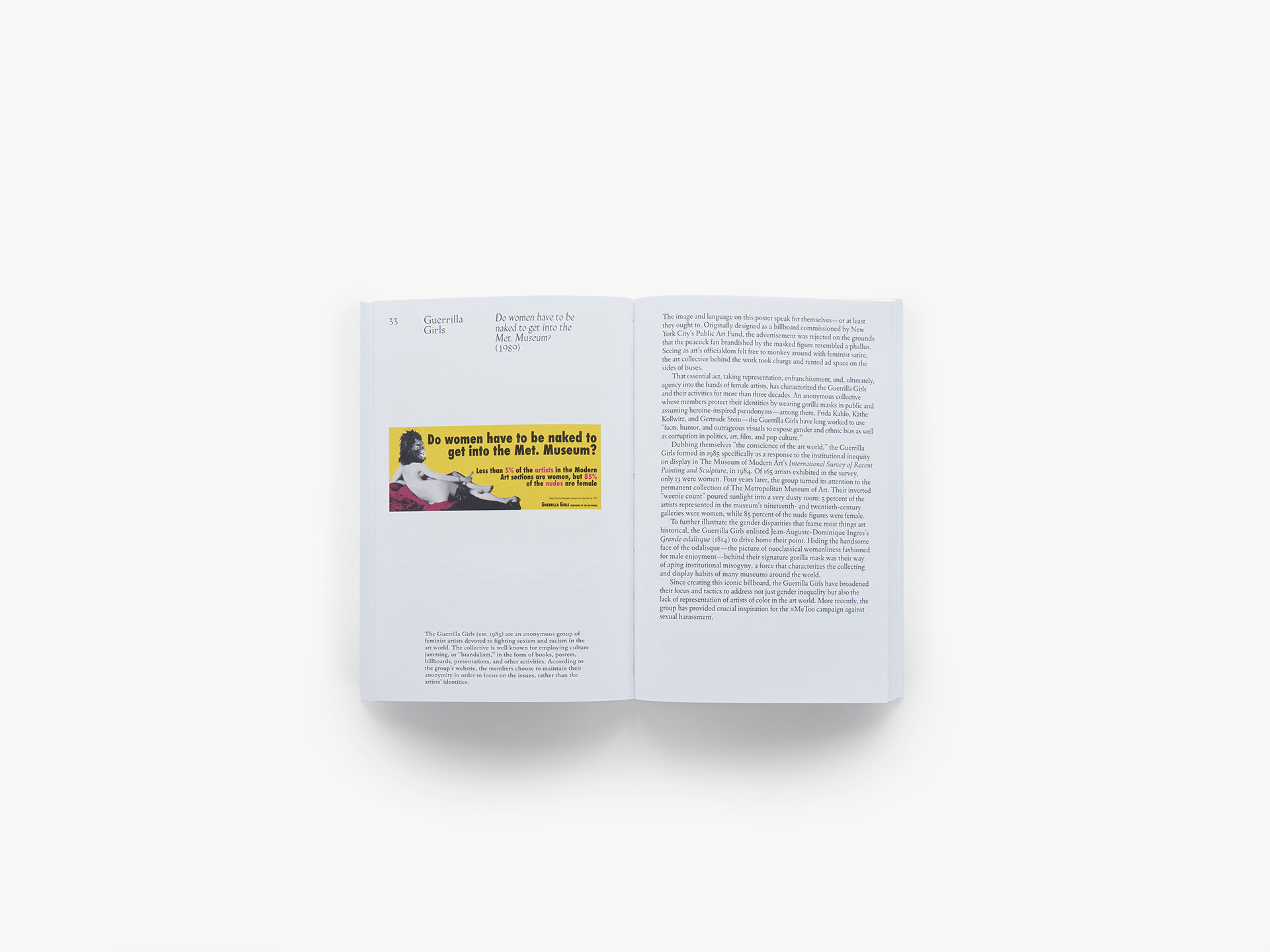
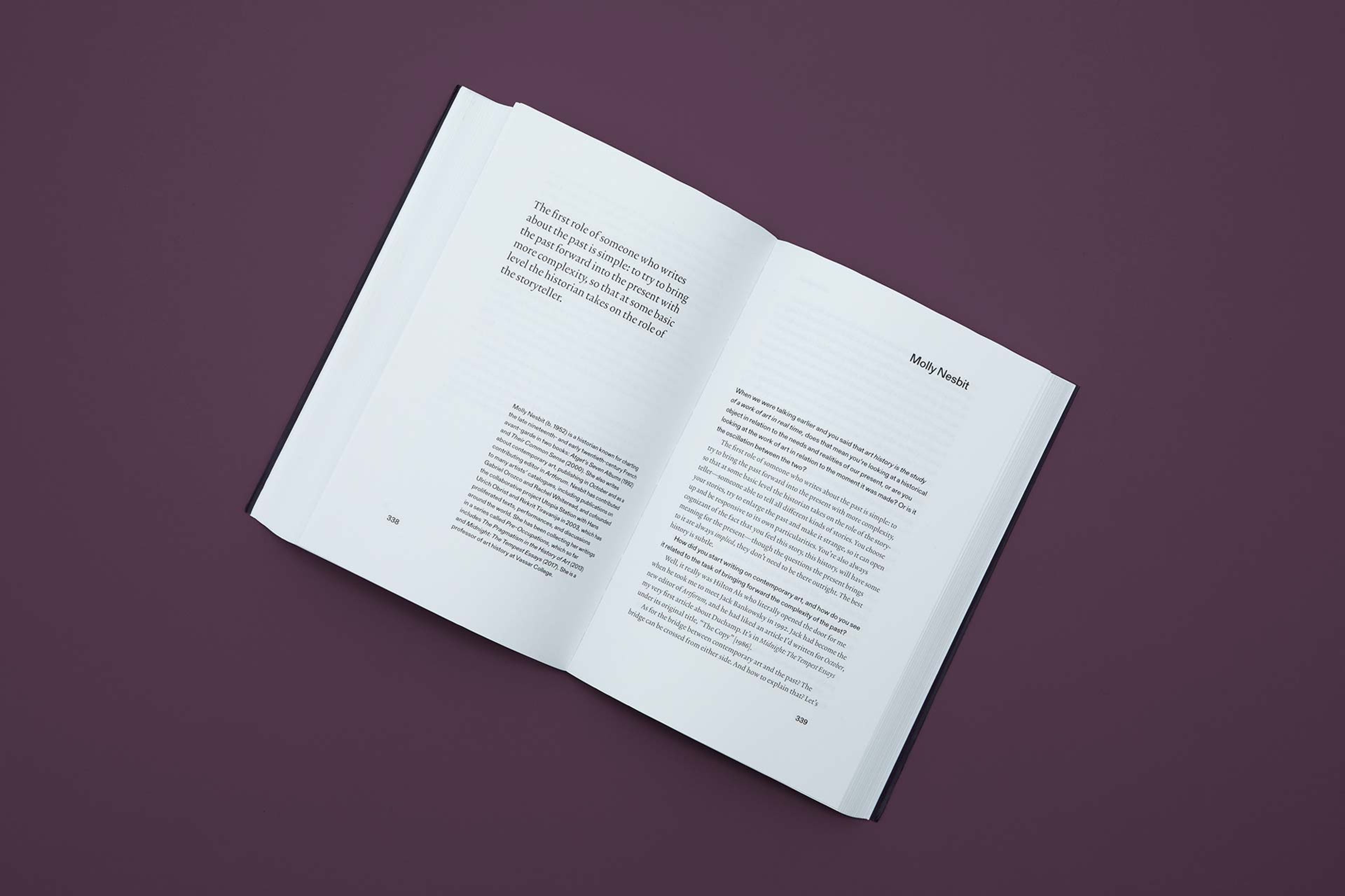
Images: What it Means to Write About Art: Interviews with art critics, published by David Zwirner Books, 2018. Photos by Zac Casto