“The interview is a very particular form as a text, in that it promises many things’’
October 12, 2018
Equal parts oral history and analysis of craft, Jarrett Earnest’s What it Means to Write About Art: Interviews with art critics, out now from David Zwirner Books, offers an unprecedented overview of American art writing. These thirty in-depth conversations chart the role of the critic as it has evolved from the 1960s to today, providing an invaluable resource for aspiring artists and writers alike. Earnest’s wide-ranging conversations with critics, historians, journalists, novelists, poets, and theorists—all of whom approach the subject from unique positions—illustrate different ways of writing, thinking, and looking at art.
As part of a series of upcoming events anticipating the book’s release, Earnest will be in conversation with Rosalind Krauss and Molly Nesbit at David Zwirner’s West 19th Street gallery on Wednesday, October 24, at 7 PM (doors 6:30 PM). The event is free and open to the public: Email rsvp@davidzwirner.com to attend.
We asked Earnest to do one more interview, with the book’s designer, Mark Thomson. In truth, this thoughtful dialogue has made us a little self-conscious about our own mode of formatting interviews on the website. Part I of the conversation follows.
There are many books of interviews in the world, and you yourself have designed a number of them—what special opportunities or problems does this format hold for designers?
The interview is a very particular form as a text, in that it promises many things: an inside track, an informality, engagement, enlightenment, evasion, and so on. Plus it is from the horse’s mouth. There is an inbuilt hierarchy in the relationship between interviewer and subject: the questions are usually shorter than the answers. So there are (at least) two characters in an interview, and it often happens that to understand one, you also need to understand the other: the interviewer’s orientation toward the subject is a key locator, one that makes the difference between an interview and a monologue. But the interviewer gets fewer words in which to reveal themselves.
In a book of interviews by a single interviewer, this question is partially resolved by a gradual accumulation of insight. In What it Means to Write About Art, by the time the reader is a few interviews in, he or she already has a clear idea about where you [Earnest] are coming from, and that insight informs and enhances the conversations. What’s especially interesting here is that the people being interviewed are the professional wordsmiths, so it’s a kind of table turner.
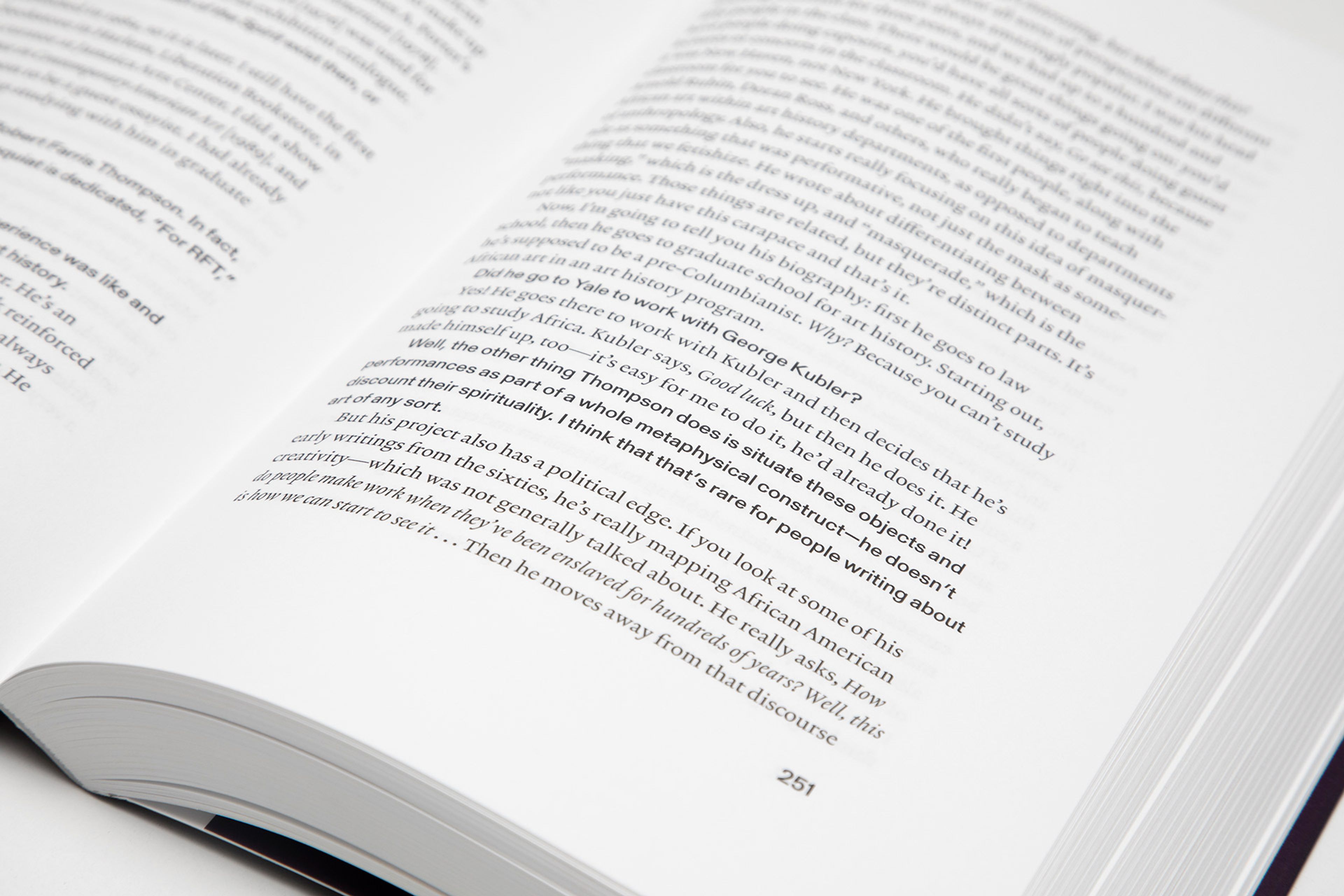
There are loads of ways to design an interview or conversation. Tiny details can have a huge impact: a text with line spaces between the two voices is very different from one without. Initials or names before each entry, as if it were a play? Too many signs! Staggering the layout of a multi-vocal interview, as if it were taking place in an imaginary room? Yes, but I’m not sure it worked that well. Then there’s the question of tempo, which is all to do with line length: the form of the line has to be in time with the subject’s voice and it also has to be reflective of the content, especially when you’re talking about art, which is obviously different than talking about sports or sofas or shoes or Brexit. And then there’s the type.
You created the solution of using two different fonts, Lexicon and Gerstner Programm, to distinguish my voice from that of the interview subjects across the book. How did you arrive at that, and how do you see it functioning from a design perspective?
There has to be enough distinction between the two voices to make them audible as individuals, but not so much that the image of them sharing a space is lost. You can’t make the questions tiny and the answers massive without both being ridiculous; all the normal societal rules of conversation apply in designing the text. When I started out, I usually used types that had a sans serif and a serif in the same family; it was an attempt to keep the voices in the same space. These days I think that was a bit simplistic; perhaps it gave more uniformity to the conversation than was actually there. The people behind the voices are different: their conversation is sharing a page; it doesn’t have to share a type skeleton too. So after a while I started using different types for different voices.
Difference can also refer to the type’s weight, which raises the question of who gets to be bold? It’s surprising when the answers are bold—as if the natural order has been inverted or subverted, in the same way that Richard Hollis did in John Berger’s Ways of Seeing, where the entire text is bold, and titles and emphasized texts are roman.
Before I started working on the design of your book I read quite a few of the interviews, so when I was thinking about what to do with the overall design form, I had a fairly good idea of the relative voices. There’s a bright energy to your questions and interjections. They are never dry or wry. What comes through is that these are conversations. There is an exchange of ideas, not just a series of more or less inert questions. That’s probably why your voice in the book is quite sharp and strong, while the voice of the subjects is more discursive and has more of a looping rhythm.
The two typefaces are about as different as can be in their essential form, one with its roots in the nineteenth- and twentieth-century grotesque, the other with roots in sixteenth-century bible types. But after a while, they seem to feed off each other—there is a question/response relationship between the types as well as between interviewer and subject.
In passing you described Lexicon as "the most beautiful font ever designed." Could you describe the specific qualities and associations of that font? Why it is the most beautiful? And with the other, Gerstner Programm? How do they play off each other when brought together?
Lexicon is the work of Bram de Does, who died in 2015. He designed two typefaces, first Trinité, then Lexicon, and they are two of the most beautiful of any era. Perhaps they are so good because he was already a great classical book designer and typographer, having followed Jan van Krimpen at the printer-publisher Enschedé in the Netherlands.
Lexicon was designed in the early 1990s for use in the Dutch dictionary, the Van Dale, and is still in use there. It is a masterpiece of dignified authority and leanness. It’s slightly ascetic. Because of that sense of economy, it is incredibly good at containing serious thought. It’s not particularly lighthearted, but neither is it ponderous nor leaden.
Lexicon was developed in collaboration with Peter Matthias Noordzij, who says that De Does didn’t think too much of it, that it lacked originality. He thought it was maybe an improvement of Times New Roman for a different (i.e., digital) production era. Noordzij recalls De Does’s attitude that Lexicon was "the most normal typeface he could think of—the archetype of the legible typeface—just normal; the most boring thing he ever did." But the drawing of Lexicon is superb, as is the justification. It is as brilliant on coated paper as it is on uncoated paper, and doesn’t fade away when the resolution gets high. For all these reasons it is the voice of the critics in the book.
The other typeface—your voice—is Gerstner Programm. The digital version of this type is the product of a new foundry called Forgotten Shapes, which is concerning itself only with faithful digitizations of previously existing but for some reason neglected or lost types. In this case, they took on a typeface originally conceived as an updating of Akzidenz Grotesk for the phototypesetting era, rationalizing its weights in the manner of Helvetica and redrawing its forms in a more consistent way. It was designed by the designer/artist Karl Gerstner and published by the Berthold type foundry, which wanted a Helvetica rival for its own Diatype phototypesetting system. Christian Mengelt, who went on to design Unica as one-third of the design group Team ’77, did the development at Gerstner’s direction. The type family was completed in 1967, just in time for the Diatype system to be superseded, and for the type to go unused to an early grave.
I am interested in the fact that Gerstner Programm is a product of the 1960s, even though it looks back all the time. In that sense it is appropriate for many if not all of the critics, and for the book as a whole. Plus the fact that Gerstner Programm was "lost" and then recovered is in some ways like the reflections of the critics on their early days.
One thing is certain: a semibold grotesque and a sixteenth-century-inflected text type together on the same page could get out of hand, and that’s where the liveliness of the conversation comes in. I gave them the same x-height, not the same point size—this means they can live together despite their differences.
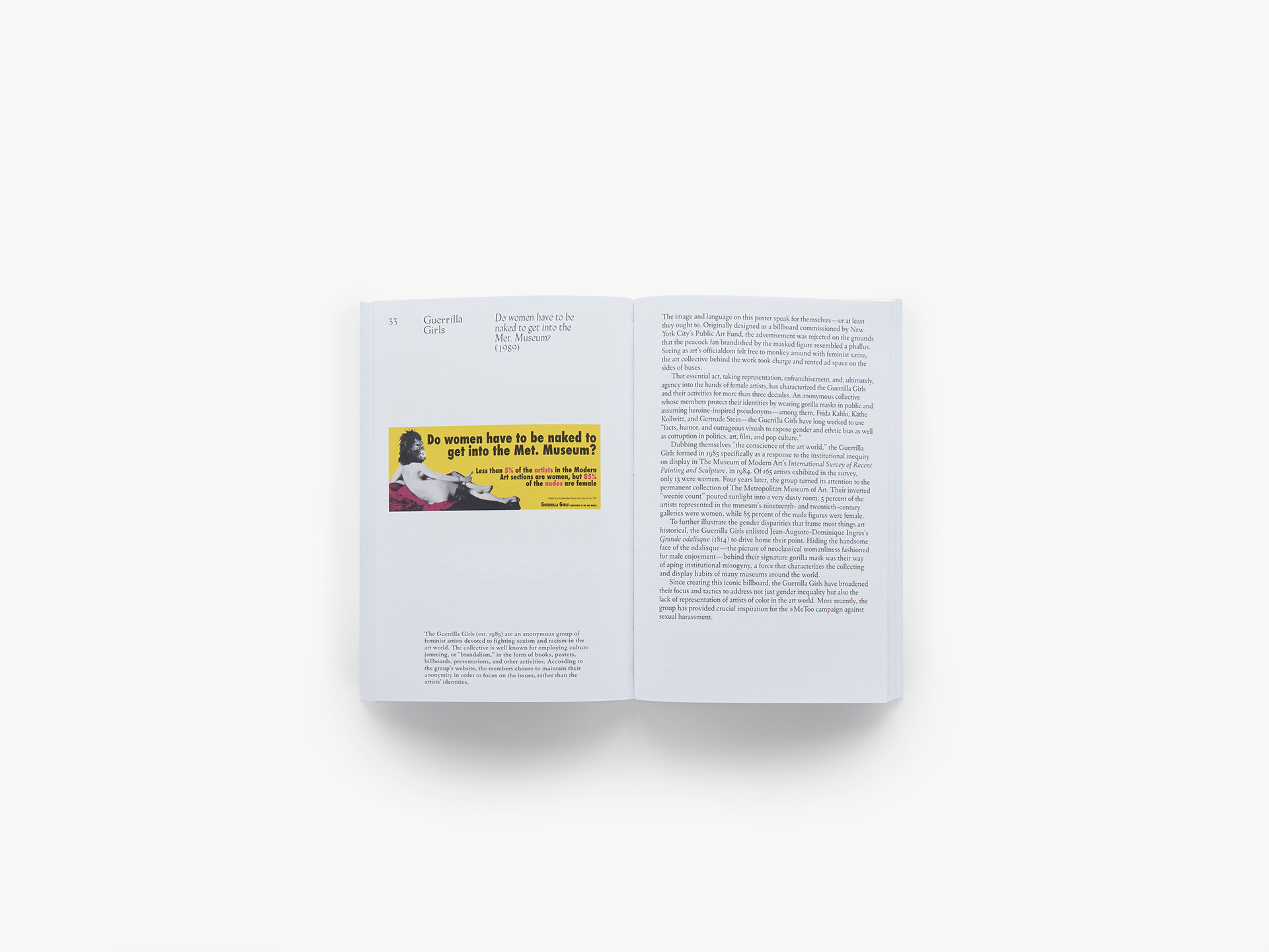
Images: What it Means to Write About Art: Interviews with art critics, published by David Zwirner Books, 2018. Photos by Zac Casto


